Giovanni Todeschino, Jean Bourdichon and Master of Claude of France, Book of Hours of Frederic of Aragon, Tours, ca. 1501–1502 (The Bibliothèque nationale de France, Paris)
What survives
More medieval books survive from the Middle Ages in Europe than any other artistic medium. Scholars refer to these hand-made books as manuscripts. Books that contain artistic decoration are called illuminated manuscripts. Manuscripts that survive from the European Middle Ages are generally religious books that reflect the canon, doctrine, and practices of Christianity, though there are Jewish and Muslim books and other types of books that survive from this time period as well.
Bifolium from the Andalusian Pink Qur’an, c. 13th century (Spain), ink, gold, silver, and opaque watercolor on paper, 31.8 x 50.2 cm (The Metropolitan Museum of Art; photo: Steven Zucker, CC BY-NC-SA 2.0)
The codex vs. the scroll
A medieval manuscript is a codex (pl. codices), meaning a book made of pages bound between two boards. Ancient scribes wrote on scrolls that were stored in boxes. These ancient scrolls only survive in occasional fragments, as a scroll is especially vulnerable to physical degradation. The pages of codices, on the other hand, are protected by their covers and have a much greater chance of survival. Thus, medieval books survive in large numbers.
Where to see medieval manuscripts
The Bibliothèque nationale de France in Paris and the British Library in London house the world’s largest collections of medieval manuscripts. Though normally only available to scholars, many museums and libraries put some of their manuscript treasures on display. Digitizing, or creating high-quality digital images of manuscripts, is increasingly common, and these images are normally available on the Internet, furthering the study of these medieval books.
A miniature of the hermit (monk) writing at a desk (detail, f. 6v), Estoire del Saint Graal, La Queste del Saint Graal, Morte Artu (Royal MS 14 E III), France, N. (Saint-Omer or Tournai?), 48.5 x 33.5 cm, 1st quarter of the 14th century (The British Library, London)
What’s in the books
The original manuscripts of the Bible, the works of Aristotle and Plato, and other ancient writers do not survive. They are known today because medieval scribes diligently copied them.
A slow and laborious process
Recording and disseminating information is quick and easy today, but in the Middle Ages in Europe, this process was slow and laborious. Monastery libraries housed most books, and all books were copied by hand, usually by monks. This process of copying and disseminating books was essential to the preservation of knowledge.
Some monks traveled to distant monasteries to view and copy books to bring back to their own monastery’s library. Fires destroyed many medieval libraries and the books they housed. Because of this and other accidents in history, not all texts survived the Middle Ages. The Name of the Rose (1980), a novel by Umberto Eco, imagines such a fate for Aristotle’s lost work on poetics.
Full-page miniature of St. Luke as an evangelist (f. 129v), ca. 500–599 C.E. This page prefaces the Gospel of Luke in Cambridge, Corpus Christi College, MS 286: Gospels of St Augustine. (Parker Library, Corpus Christi College, Cambridge, UK)
Books & Christianity
Books were essential to the practice of Christianity. Medieval Christian missionaries, such as St. Augustine of Canterbury, brought books with them as they traveled from place to place preaching and establishing new churches. The Gospel Book of St. Augustine survives today in the Parker Library of Corpus Christi College, Cambridge. It contains the text of the gospels—Matthew, Mark, Luke, and John of the New Testament—an essential work for teaching potential converts about the life of Christ. A series of images illustrating the life of Christ prefaces the text, and each book of the gospels begins with an illustration detailing the events unique to that gospel, though some of these are now lost.
Illustrations
The oldest illuminated manuscripts are among the oldest manuscripts in existence. The illustration of books was functional as well as decorative. Illuminated initials and painted miniatures marked the beginnings of important sections in the text and allowed readers to navigate the book.
Doodle in the lower margin of a page in a manuscript of Juvenal’s Satires, 15th century, MS 368, f. 64v (Carpentras, Bibliothèque municipale)
Prefatory image cycles prepared the mind of the reader to engage with the text. Some illustrations elaborate doctrines, record events, or simply tell stories. Even readers’ doodles are intriguing to contemporary scholars.
Word and image
In illuminated manuscripts, words and images worked together to inform the medieval reader, and occasionally these readers left their own mark. These books are highly interactive. Nearly all medieval manuscripts provide ample space in the margins for readers’ notes and comments. In this way, illuminated manuscripts are different from other types of media in that they provided spaces for readers to record their reactions to image and text.
The phoenix from folio 56 recto of the Aberdeen Bestiary, written and illuminated in England around 1200. The Bestiary describes this magical bird as building its own funeral pyre and then rising from the ashes.
Have you ever heard that elephants are afraid of mice? Or that foxes are deceptive? These characterizations of animals come from a medieval book called the Bestiary, or Book of Beasts. Though these books are not known to many today, you are likely familiar with some of their content. The magical beasts in the Harry Potter series come directly from medieval bestiaries. Descriptions of unicorns, phoenixes, basilisks, and centaurs are all included in the text, but misspell “bestiary” in a Google search and you will likely regret it.
The Bestiary is a medieval encyclopedia that identifies a selection of animals, plants, and precious stones. Some really exist in nature and others do not. Each entry includes a physical description, an overview of the animal’s supposed characteristics, and a run-down of its moral qualities. Many versions of these books include illustrations. Its worth keeping in mind that Bestiaries pre-date the printing press. They were copied by hand at different times and places, resulting in a wide range of variations.
The beaver from folio 11 recto of the Aberdeen Bestiary, written and illuminated in England around 1200. The beaver shows off his testicles to escape the hunters.
From a Christian perspective
The lack of scientific information in each entry makes them entertaining to read. For example, the Bestiary text describes the beaver as a gentle animal whose testicles are valued for their medicinal properties. If a beaver senses that he is being hunted, he will bite off his testicles and throw them to the hunter to save his own life. If a beaver has already done this and is hunted again, he will stand on his hind legs and show the hunter that his testicles are already missing and the hunter will let him go. The text then goes on to give a Christian moralization of the beaver, stating that “every man who heeds God’s commandment and wishes to live chastely should cut off all his vices and shameless acts, and cast them from him into the face of the devil” (source).
Sources
Adam names the animals from folio 5 recto of the Aberdeen Bestiary, written and illuminated in England around 1200
The Bestiary text is made up of several components. The bulk of the text comes from the Physiologus, a second century Greek text by an anonymous author. Relevant comments by other ancient authors such as Aristotle, Herodotus, Pliny the Elder, and Aelian are also included. The Etymologiae of Isidore of Seville, the late fifth and sixth century Archbishop, constitute a significant portion of the text. Layers of Christian commentary and moralizations were added to those earlier texts.
Content
The Bestiary begins with a retelling of the creation story from Genesis. An important event is Adam, the first man, naming all of the animals. This scene is often included in illustrated Bestiaries. Isidore of Seville believed that the names of animals were significant. He believed that an etymological study of each animal’s name would reveal something about the nature of each animal.
The content of the Bestiary, particularly the moralizations on the animals, is echoed in many medieval texts, from sermons to stories. Chaucer’s “Nun’s Priest’s Tale,” an animal story from the Canterbury Tales, makes use of the Bestiary. The main characters are a sly, deceptive fox and Chanticleer, a foolish and egotistical rooster.
Illustrations
The Bestiary was an enormously popular book in the Middle Ages and more than 130 medieval copies survive today. These copies come from all over Western Europe. The earliest manuscripts date from the tenth century and many survive from the thirteenth and fourteenth centuries. Many illustrations were drawn by artists who had never seen the relevant animal, but used the physical descriptions as a guide. The Bestiary text was influential, but these portable illustrations of animals were equally influential and likely served as models for animals in other manuscript illustrations, stone carving, wall painting, stained glass, and other media.
Jonicus, the First Astronomer in World Chronicle, about 1400–1410, Rudolf von Ems, made in Regensburg, Germany (The J. Paul Getty Museum, Ms. 33 [88.MP.70], fol. 12)
Humankind has always looked to the sky in wonder, with a desire to understand our place in the universe. Eclipses, comets, and star and planet sightings mesmerize us and inspire awe. In the medieval world, from about 500 to 1500, astronomy was a required field of study. From London to Baghdad and beyond, students of medicine, philosophy, and even theology carefully observed the astrological relationship between the 12 signs of the zodiac and one’s physical, mental, and spiritual well-being. Indeed, peoples of many religions believed that the radiant sun, full moon, twinkling stars, and distant planets held great power over their lives, the seasons, and daily activities.
The Getty Center’s exhibition The Wondrous Cosmos in Medieval Manuscripts (April 30 to July 21, 2019) invites you to marvel at the complexity of the celestial realm in European faith and science traditions, with a glimpse at how similar beliefs held sway in Asia, Africa, and the Americas. The illuminated manuscripts show how astronomy and astrology infused everyday life in the Middle Ages, from medicine to religion and beyond.
Philosophy Presenting the Seven Liberal Arts to Boethius from Consolation of Philosophy, about 1460–70, Boethius, made in Paris, France (The J. Paul Getty Museum, Ms. 42 [81.MS.11], leaf 2, verso)
Astronomy and Astrology
Faith and science—or the humanities and the sciences—were closely aligned in the Middle Ages. Universities across Europe organized their courses and bookshelves around the seven liberal arts: grammar, rhetoric, logic, music, geometry, arithmetic, and astronomy. As the study of the physics of cosmic orbs and other astral phenomena, astronomy was the foundation for astrology, which seeks to correlate these celestial events with happenings on Earth and individual human affairs. By looking at a range of manuscripts containing texts from astronomy and astrology, the exhibition shows the close relationship between the two.
A cutting from the manuscript The Consolation of Philosophy, written by the fifth- to sixth-century writer Boethius, depicts the author speaking to Philosophy, who leads personifications of each of the aforementioned subjects. The last personification is Astronomy, who gazes up at the sun and moon while holding an armillary sphere, a model of the celestial universe.
Another example from Boethius proposes a relationship between music and astronomy. In a scheme known as “the music of the spheres,” Boethius assigned musical value to each of the known planets based on their positions in the sky relative to the Earth, similar to a musical scale. The basic scale begins with the Moon, followed by Mercury, Venus, the Sun, Mars, Jupiter, and Saturn. An illumination in an early-fifteenth-century copy of the text shows Boethius explaining his method to a group: a hovering golden orb indicates a musical tone, the diatessaron (a fourth above the tone), and diapente (a fifth above). (The movement of the celestial spheres has inspired composers and musicians to the present, from Palestrina to Beyoncé, and from Franz Joseph Haydn to Nico Muhly, Sufjan Stevens, and Ariana Grande. See astrophysicist and musician Matt Russo’s brilliant TEDx talk, “What Does the Universe Sound Like? A Musical Tour” for a captivating demonstration of this long history.)
The Planet Jupiter Represented as a Bishop on Horseback (left) and Venus Riding a Stag (right) in an Astronomical Miscellany, shortly after 1464, made in Ulm or Augsburg, Germany (The J. Paul Getty Museum, Ms. Ludwig XII 8 [83.MO.137], fols. 49v and 50v)
The Influence of the Stars
All year round, from sunrise to sunset, people in medieval Europe regulated their lives based on the position and movement of heavenly luminaries (the sun and moon), the planets, and the stars that constitute the signs of the zodiac. Even the language for the days of the week shows this influence, with Latin-based names derived from planets:
Monday is moon day, and moon in Latin is luna, from which we get lundi (French), lunes (Spanish), and lunedì (Italian).
Tuesday is Mars-day (mardi, martes, martedì).
Wednesday is Mercury-day (mercredi, miércoles, mercoledì).
Thursday is Jupiter-day (jeudi, jueves, giovedì).
Friday is Venus-day (vendredi, viernes, venerdì).
Saturday is Saturn-day, but in Latin languages is the Judeo-Christian day of Sabbath (samedi, sábado, sabato).
Sunday is the day of the sun or day of the Christian God when derived from Latin.
A manuscript with various astronomical texts—called a miscellany—illustrates the degree to which cosmic forces were thought to influence one’s life. It features a series of watercolors personifying planets or celestial bodies, including the Sun as an emperor, the Moon as a woman, Mars as an armored knight, Mercury as a doctor, Jupiter as a bishop, Venus as a lady holding an arrow of love, and Saturn as an elderly man. Each figure is associated with a color and adorned accordingly: golden yellow (the Sun), green (the Moon), red (Mars), silver (Mercury), blue (Jupiter), white (Venus), and black (Saturn).
Pisces and Diagram for Friday (left) and Libra and Taurus (right) in an Astronomical Miscellany, shortly after 1464, Ulm or Augsburg, Germany (The J. Paul Getty Museum, Ms. Ludwig XII 8 [83.MO.137], fols. 56v-57)
Several pages later, circular diagrams declare the relationship between the luminaries or planets and the days of the week. For example, “Friday belongs to Venus.” At the center of the concentric circles is a representation of the planet named after the Roman goddess of love and beauty imagined as a white, six-pointed burst emanating red rays.
The 24 hours of the day—indicated by Roman numerals I through XII repeated twice—are color-coded to the heavenly body that governs quotidian activities. Thus at noon on Friday we are under the influence of the moon, whereas at six o’clock in the evening Mars holds power over us. Representations of the zodiac signs Pisces, Libra, and Taurus are also found on these pages, each accompanied by planets or a luminary (Pisces features Jupiter and Mars, Libra the moon, Saturn, and Jupiter, and Taurus Mercury, the Moon, and Saturn).
April Calendar Page with Saint George (left) and May Calendar Page with Gemini and Courtly Love (right) in a Book of Hours, about 1440–50, made in Paris, France (The J. Paul Getty Museum, Ms. Ludwig IX 6 [83.ML.102], fols. 4v-5)
Month by Month
Devotional or liturgical manuscripts often feature calendars that provide a wealth of information about faith and the cosmos. One such codex type, the book of hours, contains prayers and readings for daily to annual use. A calendar for the month of May in a mid-15th-century book of hours from Paris, for example, begins with an inscription stating that May has 31 days and 30 appearances of the moon. The first column includes Roman numerals to help readers determine the phases of the moon. They used this information to make decisions, such as when to fast or seek medicinal remedies. The second column indicates the days of the week, lettered A through G. At the bottom of the page, the artist included the so-called Labor of the Month, a seasonally appropriate activity such as picking flowers in April or sowing a field in October. Each sign of the zodiac was assigned to a full month during the Middle Ages, whereas today’s astrology follows a slightly different dating system.
The modern timeframes in the year for the zodiac signs have shifted from those in the Middle Ages, when they also dictated daily activity.
A diagram from a 1518 calendar manuscript indicates 54 major veins that may be drained according to the phases of the moon or the season of the year. This practice of bloodletting, an ancient medical process of withdrawing blood, seeks to balance bodily fluids known as humors (such as black and yellow bile and phlegm).
Left: Zodiacal Man in The Great Roman Calendar, 1518, Johann Stoeffler, made in Oppenheim, Germany (Getty Research Institute, 87-B635); right: Zodiacal Man in Très Riches Heures de Jean de Berry, 1413–16, the Limbourg Brothers, made in France (Chantilly, Musée Condé, Ms. 65)
The figure depicted also contains zodiac symbols, each one holding power over a particular body part: Aries (♈) on the head; Taurus (♉) on the neck; Gemini (♊) on the shoulders; Cancer (♋) on the chest; Leo (♌) on the sternum; Virgo (♍) on the stomach; Libra (♎) on the lower abdomen; Scorpio (♏) on the genitalia; Sagittarius (♐) on the thighs; Capricorn (♑) on the knees; Aquarius (♒) on the legs; and Pisces (♓) on the feet. The most famous medieval representation of the Zodiacal Man appears in the French manuscript known as the Très Riches Heures de Jean de Berry, illustrated by the Limbourg Brothers.
Left: The Fall of the Rebel Angels in Livre de Bonnes Meurs, about 1430, made in Avignon, France (The J. Paul Getty Museum, Ms. Ludwig XIV 9 [83.MQ.170], fol. 3v); right: The Crucifixion in the Katherine Hours, about 1480–85, Jean Bourdichon, made in Tours, France (The J. Paul Getty Museum, Ms. 6 [84.ML.746], fol. 77)
Visions of the Universe in the Christian Tradition
A selection of manuscripts in Wondrous Cosmos provides insights into Christian theology and celestial themes in sacred scripture and art. These include a music manuscript showing the creation of the world; the Book of Good Manners detailing the cosmic battle between warrior angels and rebel angels; and numerous episodes from Christ’s life (the angelic annunciation of Jesus’s birth to shepherds, the magi following a star to find the Christ child, the eclipse during the Crucifixion, and Christ’s ascension into heaven). The images and accompanying texts demonstrate the central role of heavenly lights, angels, and demons in church services and private devotional practices.
The Woman Clothed in the Sun in the Getty Apocalypse, about 1255–60, probably made in London, England (The J. Paul Getty Museum, Ms. Ludwig III 1 [83.MC.72], fols. 19v-20)
A centerpiece of the exhibition is the Getty Apocalypse, a mid-13th-century English manuscript containing the biblical book of Revelation (also called Apocalypse), which describes enigmatic visions of the end of time. One of the most stunning page spreads features the so-called Woman Clothed in the Sun, with the moon at her feet, stars in her hair, and sunlight wreathing her body. The commentary tells us that the woman represents the Church, which gives light to both day and night. She gives birth to souls saved by angels, while a dragon, representing the devil, gathers one-third of the stars of the heavens in its tail, a symbol of Apocalypse.
Left: Initial C: The Creation of the World from a noted breviary, about 1420, made in northeastern Italy (The J. Paul Getty Museum, Ms. 24 [86.ML.674], leaf 5); right: Map Rock petroglyph, 1054, Shoshone-Bannock People, Givens Hot Springs, Canyon County, southwestern Idaho (photo: Kenneth D. and Rosemarie Ann Keene)
Out of this World Connections Across the Globe
Several manuscripts and printed books in the exhibition reveal the global entanglements of astronomical or astrological ideas during the Middle Ages. For example, two miscellanies at the Getty contain constellation diagrams with the names of star groupings sometimes provided in Latin, Greek, and Latinized Arabic. This linguistic diversity confirms the connections among universities in Western Europe and centers of learning in Eastern Europe, Western Asia, and the vast Muslim world, where texts in many languages were copied, translated, and transmitted.
The tale of Barlaam and Josaphat by Rudolf von Ems, from about 1200 to 1254, illustrates cosmic themes through a story in India. At the beginning of the tale, the imaginary King Avenir of India consults astrologists to interpret omens of planetary and astral alignment related to the birth of the future prince Josaphat. They predict that the young prince will convert to Christianity, which angers the king, who then confines his son to the palace. Inspired by encounters with sickness, poverty, old age, and death, the prince still becomes Christian, fulfilling the celestial prophecies. The saying “written in the stars” expresses the belief that cosmic or universal forces control the future, a theme found in this story as well as works of history, literature, and oral tradition around the world since time immemorial.
The architecture of sacred structures built or enlarged during the medieval period and sites of pilgrimage also often evoked ideas of the cosmos and the place of humans within it. A major pilgrimage site in India, the Great Stupa at Sanchi, offered Buddhists a metaphorical microcosm of the universe. For Muslims, the Dome of the Rock in Jerusalem commemorates the Night Journey, when the angel Jibril (Gabriel) transported the Prophet Muhammad from Mecca to Jerusalem and into Heaven. Meanwhile, sculptors adorned the façade of Amiens Cathedral in France with the Virgin and Child and saints, making it a heavenly portal into the church space.
Art and Wonder Across Time
I have always been fascinated by the celestial realm. This exhibition is inspired by a range of sources in my life, including my childhood spent stargazing on camping trips and watching Star Trek and Star Wars. Carl Sagan’s Cosmos: A Personal Voyage is a long-time favorite (as is Neil deGrasse Tyson’s edition).
More recently, I’ve become fascinated by an event that captured the attention of people worldwide many centuries ago. In 1054, people witnessed the light burst of what is now known as the Crab Nebula, a supernova. Contemporaneous texts describing the fantastic cosmic event exist in Japan and Iraq; later references to the awesome astral phenomenon can be detected in China and Central Europe. Pictographs, carvings, rock art, and cave paintings found across North America may also memorialize the sighting.
Clearly an interest in the cosmos has a long history, and there is still so much to learn about our shared global past. Archeoastronomers and archivists continue to piece these clues together, drawing connections between distant communities, the medieval world, and our own time. I hope visitors to the exhibition will take a moment to pause from the business of life to ponder these connections, inspired by medieval illustrations about the cosmos.
Amyris, Poem in honor of Sultan Mehmed II, by Gian Mario Filelfo, 15th century, parchment, made in Florence, Italy, Ms. lat. 99. (Bibliothèque de Genève, Genève; photo: e-codices, CC BY-NC 2.0)
Parchment
For much of the Middle Ages, dead cows were the main ingredient for books. What was frolicking in the meadow one month may have been a page in a Bible the next. The skin of animals (calves, goats, sheep) was turned into parchment, which was subsequently cut into sheets. Parchment was introduced in late antiquity, when the codex (a book made of double leaves), was born and started to replace the papyrus scroll.
An example of high-quality parchment. Paris Bible, The Hague, mid-13th century, MS 132 F 21 (Royal Library, The Hague)
There is a lot you can tell from medieval skin. Like a physician today, the book historian can make a diagnosis by observing it carefully. The quality of parchment sheets varied considerably. Like people today, not all medieval creatures had perfect skin. Some cows loved to rub against trees while others were particularly prone to insect bites. We can still see these defects today, which appear as tiny holes, gaps or dark patches as we read Saint Jerome or Chaucer.
Perfect skin
Detail showing hair follicles, the uneven edge of the animal skin and uneven coloring on the parchment from a book likely used in monastic education. Boethius, De institutione arithmetica, MS 78 E 59, c. 1100 (Royal Library, The Hague)
The quality of the page also had a lot to do with preparation. A scribe producing a book for his own library may be less attentive than one that worked in a monastic community. The best sheets have a deep-white color, with a hint of yellow. They feel like velvet and make a slight rustling sound when you turn the page—suspenseful whispers that teased the reader. Bad skin, by contrast, crackles. It is of uneven thickness, and shows staining and a variety of colors. Unlike what you may have thought, looking at imperfect skin is far more interesting than studying its perfect counterpart. This is because a defect tells a powerful story, shedding light on the book’s production and providing clues about its use and storage post-production.
A cut, accidentally left there by the medieval parchment maker when he scraped the hairs off the processed skin. The hole contains some white hairs from the cow who “donated” his skin for the production of this book. BUR MS Q 1, c. 1100 (University Library, Leiden; photo: Erik Kwakkel)
“Through-view” of an animal head initial. Eastern France, the first third of the ninth century Msc.Nat. MS 1, fol. 25v and 26v (Staatsbibliothek, Bamberg; photo: Erik Kwakkel)
Damaged goods: holes and rips
Medieval craftsmen were well aware of the varying quality of animal skins, which they used as the basis for their books. However, calves, sheep, or goats that had given up their livelihood and skin for the sake of medieval readers were not always to blame—and neither were the scribes. The most common imperfections are holes produced by the knife of the parchment maker.
Preparing parchment was a delicate business. In order to clear the skin of flesh and hair, it was attached to a wooden frame, tight like a drum. If the round knife of the parchment maker (the lunellum) cut too deep during this scraping process, elongated rips or holes would appear. A small puncture easily became a gaping hole. The art of preparing animal skin was to apply just the right amount of pressure.
However, readers did not seem to mind the holes too much and scribes usually just wrote around them, or they repaired them. Sometimes the reader is given an unexpected sneak peek onto the next page—where a dragon may just be introduced into the story.
A tear repaired through sewing, leaving a “snake” pattern across the page, BPL MS 25, 11th century (University Library, Leiden; photo: Erik Kwakkel)
A hole in the page is filled with embroidery by the nuns who owned the manuscript. Shelfmark unknown, 14th century (University Library, Uppsala; photo: Augusta Strand)
The jabs of parchment makers—and the resulting holes—were sometimes stitched together. A page from a manuscript at the University Library, Leiden shows a former rip (a long one) snaking across the page: the scribe has stitched it up like a patient in post-op.
Repairing holes was sometimes done more eloquently. In a page from a manuscript at the University Library of Uppsala, a hole is not made to disappear, but it is highlighted by colored threads. In some monastic communities this must have been common practice, given that they repaired a lot of books with such “embroidery.” The practice turned defect into art: good-looking bad skin.
Hair follicles
Another skin problem encountered by scribes during a book’s production was the animal’s hair follicle—the skin organ that produces hair. These follicles show as pronounced black dots on the white page. Often parchment makers or scribes were able to sand them away, producing the desired smooth and cream-colored surface. However, if the follicles had been too deep in a calf or sheep, no dermatologist could have removed the imperfection, let alone the blunt instruments of the scribe. The only thing to do was to write around the patch. The follicles are helpful because they allow us to determine— from the distance between them—whether the animal was a calf, a sheep or a goat. This, in turn, may shed light on where the manuscript was produced: the use of goat, for example, often points to Italy.
A follicle pattern with such pronounced “dots” that the scribe felt compelled to write around them. BPL MS 191 A, 12th century (University Library, Leiden; photo: Erik Kwakkel)
The transition to paper
In the 12th century another material appeared in Europe: paper. Imported from Arabic culture, it was first exclusively used for documentary purposes, such as account books and letters. In a remarkable shift of scribal practices, in the fourteenth century scribes all over Europe started to use paper for manuscripts. Conservative scribes, such as monks, ignored the new material for some time, while others—especially those who wanted to economize—embraced it. Paper and parchment were used for all sorts of manuscripts, from chunky volumes to small portable books.
Tiny slip of parchment, likely made from scrap material, inserted to add notes to the text, Schedula, Leiden, University Library, BPL MS 139, 15th century (photo: Giulio Menna)
When the scribe cut sheets out of the animal hide, he would normally use the best part of the skin—what may be called the “prime cut.” This meant staying clear of the very edge of the skin because these areas were very thin and translucent, and deemed unsuitable for books. The scribe therefore cut a rim of parchment from the edge of the skin. It usually came off in tiny bits and pieces, which he called schedulae—strips. These odds and ends were thrown in the bin. Sometimes they were taken out to be used as scraps, for example for taking notes in the classroom or for smaller pages inserted into existing manuscripts (see image above). These tiny pages supplemented the text or added notes, like our yellow sticky notes today.
Layers (palimpsest)
An example of a palimpsest, Codex Guelferbytanus A, Wolfenbüttel, Herzog August Bibliothek, MS Lc 1, 6-13, fol. 90v, 6th century (lower text)
What to do when you run out of parchment as a medieval scribe? You can look around for something else to write on, such as left-over parchment strips in the bin (schedulae), or use paper, if it is available. Alternatively, you can take a book that is no longer used from your monastery’s library and scrape the text off its pages. You then simply apply text of your own. Such recycling resulted in a “palimpsest,” which holds a removed “lower text” and a newer “upper text.” The ink of the reapplied text often does not stick to the page very well, as is clearly seen in the image. Moreover, the older reading often shines through. Especially important are palimpsests from the earlier Middle Ages, because underneath this old text an even older work is buried, like a stowaway. With digital photography the lower text can sometimes be made visible again, which makes studying these books like digging for treasure.
Post-production
Scribe purchasing parchment, Hamburg Bible, 1255 (Copenhagen, Royal Library. MS 4, 2o) f. 183v.
Bad skin may also tell us something about the individuals who owned, read and stored manuscripts. The presence of holes and rips may for example indicate the cost of the materials. Studies suggest that parchment was sold in four different grades, which implies that sheets with and without visible deficiencies may have been sold at different rates. If this was indeed the case, an abundance of elongated holes in a manuscript may just point at an attempt to economize on the cost of the writing support. In other words, bad skin may have come at a good price.
Parchment provides other information about readers as well, for example that he or she stored a book in an unsuitable location. Damp places, for one, would leave a mark on the manuscript’s skin, as is clearly seen in a manuscript I sometimes call the “Moldy Psalter”—for moldy it is.
Mold has attacked these pages and turned them purple, in an almost beautiful way. Leiden, University Library, BPL MS 2896, 12th century (photo: Erik Kwakkel)
On nearly every page the top corner shows a purple rash from the mold that once attacked the skin. It is currently safe and the mold is gone, but the purple stains show just how dangerously close the book came to destruction—some corners have actually been eaten away. Similarly, if a book was stored without the proper pressure produced by a closed binding, for example because the clasp was missing, the parchment would buckle and produce “waves” on the page.
Apart from such attacks by mother nature, a manuscript could also be scarred for life by the hand of men—those evil users of books. Well known are cases where scribes and readers erased text with a knife, either because the reading was wrong or because they disagreed with it. However, in the wrong hands a knife could easily have a more severe impact on the book’s skin. All those shiny letters on the medieval page were too much for some beholders. The individual that gazed at the golden letters in the manuscript shown below used his knife to remove some of them.
The golden letters in this manuscript were stolen by a thief in the past, who cut them out with a knife. Leiden, University Library, BPL MS 59, 14th century (photo: Erik Kwakkel)
While the velvety softness of perfect skin can be quite appealing to handle, getting to know imperfect parchment is ultimately more interesting and rewarding. Damage is telling, and it may shed light on such things as the attitude of scribes (who did not necessarily mind holes on the page), the manner in which a book was stored by its owner (with a missing clasp or in a wet environment), and even the state of mind of those looking at it (“Must cut out golden letters!”). As a book historian it feels good to work with bad skin.
Wooden board of a late-medieval binding, Leiden, University Library, BPL MS 114 (photo: Giulio Menna)
Woodwork
Medieval manuscripts, even small ones, can be surprisingly heavy. Giant Bibles, large volumes that can stand half a meter tall, weigh as much as twenty-five kilos. It requires two library staff members to carry the object to your table. A fair part of this weight is produced by the boards of the bookbinding. To protect the stack of quires that made up the actual manuscript, a wooden board was placed on the front and back. The quires were then tied to thin leather straps, which were pushed through channels drilled through the boards. The straps were pegged into the wood, as seen in the image (note the white straps). It produced a surprisingly firm binding, which lasted for centuries. All this crafty woodwork is presently hidden from our eyes because the boards were subsequently covered with leather (which was often fitted with decoration). Thousands of pieces of medieval trees are presently hidden inside book bindings, like a shelved mini forest.
Wrapper
Parchment “limp binding,” Leiden, University Library, VLQ MS 1, 11th century (binding 17th? century) (photo: Giulio Menna)
The so-called “limp binding” is another type of binding that was in popular use in medieval times. Its most notable feature is the absence of boards, which explains its name. With a limp binding the quires are covered by a plain parchment wrapper without the support of wooden boards.The quires in these bindings—usually a limited number—are attached to the outer parchment with thin strings, which are visible on the outside. A limp binding resulted in a lighter manuscript, which meant it was easier to transport. This type of binding also decreased the cost, given that wood was not needed and that the binding process was less time-consuming. This is likely why this type of bookbinding was so popular among medieval students.
Accessories
Leiden, University Library, BPL MS 2778 (photo: Giulio Menna)
Many medieval books were a joy to look at even when they were closed. Various shiny “accessories” were drilled in and attached to the wooden boards on the outside of the book. The most pronounced of these are the so-called “bosses,” protective metal pieces attached to each corner of the binding. Much more common are clasps, pieces of metal that kept the book closed. These were needed because, unlike paper, parchment has a tendency to expand and buckle, which could push the book open. A clasp was therefore needed to keep the book closed when not in use, protecting the text inside. Also frequently added to the binding is decoration—flower motifs, playful line patterns, and at times even a painted scene. Such decorative elements on the outside of the binding became particularly common near the end of the Middle Ages.
Into a letter P: St. Paul at the desk with ruled quire, writing, Eusebius Hieronymus, Hamburg Bible, 1255 (The Royal Library, Denmark, MS GKS 4 2°, vol. III, f. 125r)
Get set!
Before a single word flowed from his pen, the scribe needed to prepare the page. Whether he had opted for parchment or paper, the sheets were completely blank to start with. So, he first needed to think about a sensible layout, carefully considering his options. Did the text he was about to copy carry certain conventions? Was it, for example, a book that was to contain glosses (notes), or was it made for portable use? Preparing the page was a labor-intensive process, especially when the scribe had opted for a complex layout, with multiple columns and glosses. It was important to get it right since a messy layout would produce a messy book.
Left: Prickings at the parchment edge used to create a ruled page. Boethius, De institutione arithmetica, c. 1100 (Royal Library, The Hague, MS 78 E 59); right: Blind rules created with a hard point (detail), Statius, Thebais, c. 1100 (Royal Library, The Hague, MS 128 A 38)
Rules
Unlike our notebooks today, medieval paper and parchment sheets did not come with ruled lines when you purchased them. A medieval page consisted of both horizontal and vertical ruling. To add these guiding lines to the blank page, the scribe would prick tiny holes in the outer margins, as well as in the upper and lower ones. Lines were then drawn between these holes, usually with the help of a ruler: horizontal lines to guide the space between each line of text, and vertical lines to confine the left and right side of the textblock.
Liber Exodus, glossed Bible, c. 12th century, Italy (Leiden, University Library, VLQ MS 104; photo: Giulio Menna)
Until the early twelfth century, the ruling was done by pressing down on the parchment with a sharp object (a “hard point”), producing a “gutter” that would guide the scribe’s pen. In the twelfth century, this type of ruling was replaced by drawing lines with a pencil (called a “plummet”), which left more visible traces on the surface of the page. From the thirteenth century, a pen was used as well. Because of all these horizontal and vertical lines, if a layout was very complex, the ruling pattern may appear as a true cobweb.
Puzzles
How a page was designed depended on a variety of factors, including the number of required text columns, the space left blank for decoration, and the presence of marginal glosses and running titles. The most basic layout consisted of a single column of text. They are frequently encountered in Books of Hours (books made for use in private devotion), because these are commonly smaller books, which facilitated portability. Bigger books of two or more columns often required more work in the design stage, especially if that book also featured a marginal commentary. Particularly challenging were those cases where the commentary was of unequal length. This meant that the scribe had to design each page separately. Piecing together the segments of main text and commentary was like solving a puzzle.
Quire consisting of 5 bifolia (photo: Fitzwilliam Museum)
Location, location, location
As with our modern books, medieval manuscripts consist of quires, small packages of folded leaves. Scribes often produced the quires themselves, but it also appears that they used prefabricated quires bought in a shop. The scribe would copy the text onto the pages of the quire, which would later be bound together to form the completed manuscript. To make sure that each finished quire ended up in the correct order, the scribe often wrote the first words of the next quire in the lower margin of the last page he copied. These are called “catchwords.”
If the catchword at the end of the quire matched the first word on the next quire, then they were in the correct sequence. To help binders put the quires in the right order, scribes would also number them. In the later Middle Ages, further organization was added to the page by also numbering the individual bifolia, so as to keep track of their specific location within the quire. In spite of all this emphasis on location, from time to time, binders still jumbled up the sequence.
Bundling sheets
Quires are usually made from bifolia (singular: bifolium) or double-sheets of parchment or paper. To create a bifolium, a sheet is folded in half (each half is called a “folium,” which consists of two pages, i.e. the front and back of the folium). If the quire is the building block of the medieval book, the bifolium is what defines the quire: four, five or six of them were bundled up and subsequently filled with text.
Looking closely at the binding of the book, each bifolium appears to embrace its neighbor, bonding together to produce a strong quire. Before roughly 1200, bifolia were usually cut from processed animal skins, each of which usually supplied usually one to four double-sheets. They were either cut from the skin, or the skin was simply folded, either once (folio), twice (quarto), or three times (octavo). Paper double-sheets were exclusively produced by folding the full sheet.
Left: detail of manuscript bifolia, 11th century (Leiden, University Library, VLQ MS 1; photo: Giulio Menna); right: detail of quires bound together, Irenaeus of Lyons, 1300–1350 (Leiden, University Library, MS VLF 33; photo: Giulio Menna)
Irregularities
Quires form the building blocks of the manuscript. How many bifolia the scribe bundled together often depended on his or her location. Book producers in England, for example, are known to have regularly produced quires of six bifolia, while scribes on the continent typically preferred quires of four bifolia. Some quires are irregular. An extra folium could be added (called a singleton) or a leaf could be cut out. Such instances of irregularity are of great interest to book historians, because they may suggest that the original composition was expanded by the scribe (for which an extra folium was needed) or because a blank folium was removed at a later stage, for example because it came in handy for taking notes.
Jean le Tavernier, Portrait of Jean Miélot in his workshop, after 1456, Miracles de Notre Dame, Paris, Bibliothèque nationale de France, MS fr. 9198
The hard work of the scribe
“The fingers write, but the whole body suffers,” (medieval saying)
Parchment makers prepared skins, scribes cut their pens and filled their ink pots, and binders packed their workshops with leather and wood. All these activities would be in vain were it not for the single event that sparked them: copying words.
Writing a medieval text with a quill is hard work. The pen could only make a more or less downward movement because of how the nib was cut. It meant that letters had to be broken up into multiple pen strokes. This made writing a very slow process: a Bible could easily take a year to complete. A scribe’s handwriting—script—can tell us where and when he was trained to write. Script tells us these things because the shape of letters was constantly changing—script is thus an important historical tool that helps to place stories and information into their proper cultural-historical setting.
What you can learn from medieval script
Medieval script—the handwriting of the scribe—is the material representation of a text. An author may have composed the text, producing the original thought, poem or story, but it was often the scribe who put these words on the page. Much rides on how he did this. If he was inexperienced, it may be difficult to decipher his writing. If he was sloppy, the wrong words may appear on the page, or the right ones in the wrong order. The handwriting of scribes varied considerably. Not only did individual scribes vary their individual letter forms, as we still do today, but style of medieval script often depended on when and where it was written. This makes script extremely useful for book historians: the producer of a manuscript may tell us, between the lines, where and when he made the book. “My maker is from Germany,” a letter or abbreviation may for example say. From time to time scribes would even say so explicitly, in a colophon at the end of the book.
The main book script of the Middle Ages: Caroline Minuscule
Carolingian script (detail), Liberatus of Carthage, The Hague, Royal Library, MS 75 B 24, fol. 4r, 10th century
Caroline Minuscule is the primary script of the early Middle Ages. Created in the late eighth century, it became the main book script in the empire of Charlemagne. It is an elegant script with a particularly round and spacious appearance Because Charlemagne had conquered a vast amount of territory during his reign, he found himself with an empire of many cultures, each with its own style of handwriting. A cohesive and unifying script was needed if his administration was to function properly. Caroline Minuscule looks familiar to our modern eyes because producers of typeface working for early Italian printers used it as a model. In fact, the ubiquitous default font “Times Roman” on our computers is also based on Caroline Minuscule.
The transition to Gothic script
A transitional script, where some letters retain the form of the Caroline Minuscule, and some begin to show features of Gothic script. Statius, Thebais, The Hague, Royal Library, MS 128 A 38, c. 1100
From the middle of the eleventh century Caroline Minuscule, the dominant book script at that time, started to include new letter forms. By 1100 the number of letter transformations had grown to such an extent that the script looked different from Caroline. Slowly the script evolved into what may be regarded as the second major book script of the Middle Ages: Gothic (used from c. 1225). Where Caroline was a unifying script, the transitional script of “The Long Twelfth Century” (1075-1225) divided Europe in distinct regions. Scribes in Europe adopted the new, hybrid writing form at different speeds, while they also varied the actual appearance of certain letter forms. Scribes in Germany, for example, were far more conservative than their peers in France and England.
Cursive vs. book script
Leiden, University Library, LTK MS 576, 15th century (photo: Giulio Menna)
Books written between 1250 and 1600 were copied in a variety of Gothic scripts, some of which sport very different features. On the one side of the spectrum, there are formal book hands, presenting upright letters that appear to stand at attention. On the other side there are more casual cursive scripts, which were written with a thinner pen and featured connecting loops. By the early fifteenth century these two script forms were equally popular, although cursive script was introduced much later in book production. The introduction of cursive script is part of a broadening palette of scripts. This expansion may have resulted from the commercialization of book production—a consequence of the increasing demands of readers who purchased their books in small urban shops.
Cursive script began its career in the world of administration. Here it was used for account books, charters and other administrative texts. The clerks who produced these documents used a much thinner pen than what was used for formal book script. The flexible tip allowed for a faster pace and it gave the script a kind of “casual” feel.
While book script required the pen to be lifted between each stroke that formed the letter, with cursive script the pen remained on the surface of the page, with each letter connected by a ligature (or loop). Around 1300 this administrative script was exported to the world of book production. Students and scholars were early adopters, as were individuals involved in administrative duties, such as clerks, notaries and merchants. Civic clerks, for example, are known to have produced literary manuscripts after-hours, in part for an urban clientele who paid for their services. These professional users encouraged the migration of the script beyond its initial administrative setting.
While one may be inclined to emphasize how “foreign” the medieval book is—they are, after all, made of dead cows, and are handwritten—they present such recognizably modern features as a justified text, footnotes, running titles and page numbers.
Leaf (page) number in Paris Bible, London, British Library, Arundel MS 311, fol. 240, 13th century
Visiting a bookseller
The similarities run much further than mere physical traits, however. Take for example the manner in which the book was made and acquired from the 13th century onwards. If you wanted a book in the later Middle Ages you went to a store, as in our modern day. However, the bookseller did not normally have any books in stock—except for perhaps some second-hand copies. You would tell him what you wanted, both content-wise and with respect to the object’s material features. You could specify, for example, that he use paper (instead of parchment), cursive script (and not book script) and add miniatures (or forego decoration). Just like so many other objects you bought in late-medieval society, the commercially-made manuscript was custom-tailored to the individual who purchased it.
The professionals who made books for profit were usually found near the biggest church in town. This was a well-chosen spot as canons and clerics (i.e. people who visited the church and who could read) formed an important part of the clientele. By the 14th century true communities of the book had formed in the neighborhoods around churches and cathedrals. Evidence from such cities as Antwerp, Bruges, Brussels, London and Paris suggests that in these communities a diverse group of artisans interacted with clients and with each other. It was a world bound not only by the book, however, but also by profit.
Marketing
Whether you were scribe, illuminator or binder, as a professional you would strive for quality and diversity as this ensured bread and butter on the table. In parallel to our modern book business, medieval manuscript artisans used various marketing strategies to attract new clientele. The most striking of these is advertisements. Scribes hung large sheets outside their doors to show what kind of scripts they had mastered. The short writing samples found on these sheets were often accompanied by the names of the scripts, which shows just how professional the world of the book had become. A particularly rich specimen survives from the shop of Herman Strepel, a professional scribe in Münster (c. 1447). In the true spirit of medieval marketing he wrote the names of all the scripts in golden letters on his advertisement sheet.
Advertisement sheet from Herman Strepel, professional scribe in Münster, The Hague, Royal Library, 76 D MS 45, c. 1447
Scribes also included advertisements in books they had copied for a client. An example of such “spam” is found in a French manuscript made in Paris by a scribe who calls himself Herneis. On the last page of the book he writes, “If someone else would like such a handsome book, come and look me up in Paris, across the Notre Dame cathedral.” Herneis and his fellow bookmen lived and worked in the Rue Neuve Notre Dame, which served as the center of commercially-made vernacular books. Similarly, students were served in the Rue St Jacques, on the Left Bank, where the latest Latin textbooks were on offer. For Parisians and students it was handy to have all the professionals in one street: you knew where to go when you needed a book and it was easy to check out who was available for making one for you.
Advertisement by Herneis le Romanceur, professional scribe in Paris. Giessen, Universitätsbibliothek, MS 945, 13th century
Book streets
This centralization was equally convenient, however, for the artisans themselves. Booksellers (also called stationers) in Rue Neuve Notre Dame and in other such “book streets” in European cities depended on the professional scribes, illuminators and binders that lived in their vicinity. They would hire them for various projects. When a client came to order a book from a stationer, the latter would divide the work among the artisans he usually worked with. One copied the text, another drew the images, and a third bound the book. These hired hands were given contracts which specified precisely what they would have to do and how much money they received for it. From time to time the stationer would come and check on the progress they made. In some manuscripts these cost estimates were scribbled in the margin. Although making books for profit was a common scenario in the later Middle Ages, it did not make you particularly rich. On the last page of a Middle Dutch chronicle a clearly frustrated scribe wrote, “For so little money I never want to produce a book ever again!”
Marginal note in pencil regarding payment to the professional scribe Jehan de Sanlis, “ci (com)me(n)ce Jeha(n) de Sanlis a ratable VI d. a la piece” (Jehan de Sanlis made this for 6 pence per quire), The Hague, Royal Library, MS 71 A 24, 13th century
The printing press and the demise of the manuscript
The world of professional medieval scribes was shaken up by the coming of Gutenberg’s printing press around the middle of the 15th century. The ink pots dried up and the handwritten book slowly turned into an archaic object that was more costly than its printed counterpart. In the 16th century only large choir books (which did not fit on the press) and handsome presentation copies, custom-made for an affluent client, were still written by hand.
And so we see scribes jumping the handwritten ship, many ending up working in printing shops. Here, too, a striking parallel between the medieval and modern world of the book may be pointed out. Medieval producers and salesmen of books had to adapt to the new medium made popular by Johannes Gutenberg, just as publishers today have to change their ways in a world where pixels are gaining ground over ink.
Some medieval readers preferred pretty pictures and shiny decoration in their books. Not only did the sparkling page appeal to them, it also proved their economic status, or that the gift they gave was special. Undecorated books were also expensive, but decorated copies cost a true fortune, especially if gold was used. In a process called gilding, the decorator would apply an ultra-thin film of flattened gold to the page, which looked not unlike our modern tin foil.
Gilding, Leiden, University Library, VLQ MS 4, 14th century (photo: Giulio Menna)
This page shows that the golden shapes were not appended directly to the surface of the parchment, but that they were stretched over little “hills” of plaster (note how the orange primer is shining through). This way the gold would catch the light from different angles, maximizing its dazzling effect.
Colorful books
Decorated initial, Leiden, University Library, VLQ MS 38, 12th century (photo: Giulio Menna)
When the quires were filled with text, the rubrics (title or chapter heading, often in red) were in place, and the scribe had corrected his work, it was time for the finishing touches. Many medieval books contain some kind of decoration in addition to the written words, usually executed by a different artisan. There is a considerable variation in style and quality of decoration, and, consequently, in cost. At the lower end of the scale is penwork flourishing, red and blue lines drawn with the pen in various patterns and shapes. Some of these typify local styles, allowing us to tie a manuscript to a specific country, city or religious house. At the higher end of the scale is illumination: often sophisticated little paintings that included color and often gold. While decorated books stand out among their other cousins, on the whole they were not very common.
Historiated initial, Leiden, University Library, BPL MS 14 D, 13th century
One-letter stories
Normally, letters work together to form words that present a story. From time to time, however, we encounter a letter that contains a narrative all by itself. This giant P initiates the name Paulus (Paul), who was the author of the following Bible text. To mark the beginning of the text the decorator extended the P and applied color and gold to it, turning the letter into a visual aid. Contained in the letter is St Paul himself, presented as the soldier of Christ. In his hand there is a large sword, his standard attribute in medieval decoration, and his head is clearly bald, which also aided in his identification.
While in this case the intensions of the decorator are clear, the meaning of some such historiated initials can only be understood by reading the story they initiate. Miniatures contained even more extensive narratives.
Leiden, University Library, VLQ MS 4
Penwork
In medieval times, penwork flourishing was the quickest and easiest way to add some color to the page. This style of decoration typically involves thin lines, usually in red and blue, drawn with a pen rather than a brush. The swirly lines form lively patterns with unexpected twists and turns, creating miniature mazes in which your eye gets lost easily. If you look carefully you may recognize familiar objects: a tree, the moon, pearls, a smiling face. The central figure attracting all of this artistic attention is the capital letter that needed decorating, in this case the letter “M” (for “Marcus”). The penwork decoration supported an important function of this letter, navigating the reader to the beginning of a new section of text. The specific flourishing patterns can often be pinpointed to a certain city or region, which turns these happy lines into a useful tool for the book historian.
Dr Kathleen Doyle introduces the characteristics and evolution of medieval biblical illumination, discussing the various functions of images in biblical texts, together with the use of different materials, calligraphic embellishments and stylistic influences.
Illuminated manuscripts offer some of the best evidence for our understanding of Christian artistic interpretations of the Bible. Through them we can begin to appreciate the value placed on such art. Only significant investment of resources – hours of labour and significant expenditure – made such works possible. Each manuscript, by definition, was made by hand (Latin manu scriptus: ‘written by hand’), and each illumination required the dedicated work of a highly skilled person, or persons. Each incurred significant cost in materials and the time spent on its production. No wonder, then, that so many illuminated manuscripts of the Bible were treasured in their day for more than their material value, and gained the status of gifts worthy of saints and kings.
Decorative and illuminated calligraphy is present in the sacred texts of several religions, but among the Abrahamic faiths only Christian scripture is also illustrated extensively in grand copies. Within the Jewish tradition, figurative imagery is limited to certain books and biblical commentaries (never the Torah). This is based on a strict interpretation of the Second Commandment against graven images or likenesses (Exodus 20.4). However, in both Western and Eastern Christendom almost any type of decoration is possible, whether individual narrative images in letters, literal or allegorical illustration, or story-telling biblical picture books where text is minimal.
For over a thousand years, and throughout the Christian world, scribes and artists embellished and illustrated biblical manuscripts in order to adorn and elaborate the sacred text. The most sumptuous works that they produced are now described as ‘illuminated’, meaning that they are enhanced by the application of gold or silver and painted or drawn decoration. In the early medieval period, most scribes and illuminators were monks or clerics. In the later Middle Ages, these activities were taken over, generally, by commercial lay scribes and artists. Many artists worked collaboratively in loose associations or partnerships in major towns and cities such as London, Paris, Utrecht, Rome and Bruges. From documentary evidence it is clear that many of these artists worked in a variety of media, but it is almost exclusively their painting in books that survives and gives us a glimpse into the great artistry of the Middle Ages.
A decorative panel, or ‘endpiece’, following the Gospel of St Luke in the Codex Alexandrinus. Codex Alexandrinus (Gregory-Aland 02), Bible in four volumes: Volume 4 (New Testament), 5th century, parchment codex, 32 x 28 cm (The British Library)
The justification for the use of images
Illumination of Christian Bibles seems to have been taken place from an early date. The first decoration occurs in the earliest surviving complete copy of the entire canon: Codex Alexandrinus, dating from the 5th century. In this Greek Bible, the decorative panels at the end of each book (‘endpieces’) include stylised botanical images as well as other forms, such as a chalice, a Eucharistic symbol.
The Golden Canon Tables were painted around the time that Pope Gregory the Great (c. 540–604) famously chastised the bishop of Marseilles for destroying images of saints in his church. Indeed, St Gregory actively encouraged the use of images, equating pictures with books for the illiterate to ‘read’. Perhaps this argument could be used to explain the illustrated manuscripts made for patrons who may not have been entirely comfortable in Latin, such as the Harley Bible moralisée, with its hundreds of images. When justifying the incorporation of images in Bibles, biblical commentaries and devotional and liturgical works, St Gregory further elucidated the distinction between ‘adoring a picture and learning from its story what is to be adored’.
In the East, however, the point was more contentious. In 726 the Byzantine emperor Leo III the Isarian (r. 717–741) issued an edict declaring all images to be idols and ordering their destruction in what is now known as the Iconoclast (literally, ‘image-breakers’) Controversy. After periods when this policy was temporarily relaxed or reversed, it came to an end formally in 842, with the accession of Empress Theodora (r. 842–856), who restored the use of icons, or images, to be venerated. This event is still celebrated as the Feast of Orthodoxy in the Eastern Church on the first Sunday in Lent. The justification for the reintroduction of images was set out in the Second Council of Nicaea in 787, which declared that:
Also [we declare] that one may render to them [icons] the veneration of honour; not the true worship of our faith, which is due only to the divine nature, but the same kind of veneration as is offered to the form of the precious and life-giving cross, to the holy gospels, and to the other holy dedicated items.[1]
The iconoclasts are represented in a marginal illustration in the Theodore Psalter. Theodore of Caesarea, Theodore Psalter, 1066, Constantinople, parchment, 23 x 22 cm (The British Library)
The elaborately illuminated Theodore Psalter exemplifies the quality of illuminated biblical books created in the Eastern capital following these events. It even includes portraits of the important figures in the debate in its marginal commentaries.
The use of precious metals in Bibles
In the most luxurious codices, the biblical text is enhanced further through the use of gold ink or gold leaf. In most manuscripts, gold appears more frequently as gold leaf, typically affixed to a gum and burnished with a polished stone or animal tooth. The result, as seen in the background and details of the illuminated Bibles from the Carolingian period onwards, is spectacular – these images are untarnished, and still shine, centuries after they were made. In a Christian context, the use of precious materials underlines the importance of the text itself. The gold backgrounds create a heavenly setting and place the figures in a spiritual context. Shimmering backgrounds to Evangelist and other author portraits in both Byzantine and Western manuscripts emphasise the divine inspiration of their texts.
A portrait of St Mark, painted on a gold background, in the Burney Gospels. Kokkinobaphos Master (illustrator), Burney Gospels, 10th–12th centuries, parchment, 22 x 17 cm (The British Library)
Stylised calligraphy in biblical illumination
One of the most striking aspects of Bible decoration is the use of stylised calligraphy in different forms to ornament the text, whereby individual letters, and sometimes entire words, become elements of design. In many Latin manuscripts, the initial letter of each biblical book is enlarged and elaborated, often including decorative panels and shapes. An extreme example of this elaboration occurs in the justly famous Lindisfarne Gospels. Here the first words of each Gospel and of St Jerome’s letters are expanded to fill much of the page, and are intricately decorated with complex patterns.
An intricately decorated incipit page, showing the first words of the Gospel of St John, from the Lindisfarne Gospels. The Lindisfarne Gospels, c. 700, parchment, 36.5 x 27.5 cm (The British Library)
Historiated initials
In addition to calligraphic embellishment, initial letters of words could be ‘historiated’, or decorated with illustrations reflecting or commenting on the story of the text. These commonly occurred at the beginning of biblical books or important psalm divisions. The first example of this in the West occurs in the 8th-century Vespasian Psalter made in Kent, in which depictions of animals are placed between letters and depictions of David are set within the form of the letter itself. The historiated initial quickly became a customary feature of luxury biblical codices for the following 800 years, evident in the 12th-century Winchester Psalter and the 15th-century Great Bible.
A historiated initial D representing David as a shepherd, rescuing a lamb from a lion at the beginning of Psalm 38, from the Vespasian Psalter. Psalter (‘The Vespasian Psalter’), 2nd quarter of the 8th century–mid-9th century (The British Library)
Stylistic influences on biblical paintings
Stylistically, the paintings in Bibles draw on the heritage of the ancient world of Greece and Rome. This is particularly noticeable in the sophisticated painting in the early Christian period, now known from the remains of luxury codices such as the Golden Canon Tables and the Cotton Genesis. In content, too, both the Eastern and Western Church adopted the traditional Antique author portrait to preface the Gospels with Evangelists portraits. In many portraits, the Evangelists were dressed in stylised classical robes. Typically the Evangelists are depicted in the act of writing out their text, holding pens and knives to make corrections, as noted earlier, and often with legible initial words in their open volumes.
A portrait of St Luke. Guest-Coutts New Testament, mid-10th century, parchment, 29 x 20.5 cm (The British Library)
Narrative sequences
Throughout Christendom other more extensive and exegetical, or narrative, sequences of illustration were employed in Bibles. The massive Carolingian Moutier-Grandval Bible, for example, includes full-page illustrations of events related in Genesis and Exodus, but also more complicated visual commentaries of the relationship between the Old and New Testaments.
A full-page illustration of the Creation of Adam and Eve and the Fall, preceding the Book of Genesis in the Moutier-Grandval Bible. Bible (The ‘Moutier-Grandval Bible’), c. 830–840, parchment (The British Library)
Sometimes these cycles of illumination were incorporated into the body of the text, as in the 13th-century Gospel Lectionary made in Mosul, which includes an extended narrative comprising scenes from the life of Christ. More typically, the illustrations precede the text, as in illustrated psalters where images of Christ’s life and Passion precede the psalms. There they provide an additional devotional context and focus, and emphasise their prophetic nature. The first extensive cycle of prefatory images appeared in the West in the Tiberius Psalter, made in Winchester in the 11th century.
Psalter (the ‘Tiberius Psalter’), 2nd or 3rd quarter of the 11th century (The British Library)
Their use became widespread in luxury psalters throughout the Western Christian world. Another beautiful example is the Winchester Psalter from 12th-century England. Both volumes are reminders that books and other liturgical or devotional objects such as icons, chalices and pyxes were portable, and as a result had a wide circulation, as princely gifts and prized personal devotional possessions.
Another approach to illustration is taken in the Harley Psalter, a copy of a famous Carolingian manuscript, in which the accompanying pictures correspond directly to the verses of the Psalms, translating them virtually phrase-by-phrase into visual form.
The Harley Psalter includes over 100 coloured line drawings, illustrating the Psalms. Psalter (the ‘Harley Psalter’), c. 1000, parchment, 38 x 31 cm (The British Library)
The Last Supper, in Bible (the ‘Holkham Bible Picture Book’), c. 1327–1335, parchment, 28.5 x 21 cm (The British Library)
In other books, probably designed for a lay readership, images dominate, with the biblical text paraphrased or providing captions for biblical picture books. In an important early example, the Old English Hexateuch, the vivid images fill most or all of its pages, accompanied by the earliest surviving translation into English of some parts of the Old Testament. By the 14th century another English example, the Holkham Bible Picture Book, included captions in French. Other 14th- and 15th-century Bibles with more extensive biblical or paraphrased text also appeared in the vernacular.
Footnote:
[1] Definition of the Holy Great and Ecumenical Council, the Second in Nicaea, trans. in Daniel J. Sahas, Icon and Logos: Sources in Eight-Century Iconoclasm, Toronto Medieval Texts and Translations, 4 (Toronto: University of Toronto Press, 1986), p. 179.
A medieval monk takes up a quill pen, fashioned from a goose feather, and dips it into a rich, black ink made from soot. Seated on a wooden chair in the scriptorium of Lindisfarne, an island off the coast of Northumberland in England, he stares hard at the words from a manuscript made in Italy. This book is his exemplar, the codex (a bound book, made from sheets of paper or parchment) from which he is to copy the Gospels of Matthew, Mark, Luke and John.
Lindisfarne Gospels, St. Matthew (detail), Second Initial Page, f.29, early 8th century (British Library)
For about the next six years, he will copy this Latin. He will illuminate the gospel text with a weave of fantastic images— snakes that twist themselves into knots or birds, their curvaceous and overlapping forms creating the illusion of a third dimension into which a viewer can lose him or herself in meditative contemplation.
The book is a spectacular example of Insular or Hiberno-Saxon art—works produced in the British Isles between 500–900 C.E., a time of devastating invasions and political upheavals. Monks read from it during rituals at their Lindisfarne Priory on Holy Island, a Christian community that safeguarded the shrine of St Cuthbert, a bishop who died in 687 and whose relics were thought to have curative and miracle-working powers.
A Northumbrian monk, very likely the bishop Eadfrith, illuminated the codex in the early 8th century. Two-hundred and fifty-nine written and recorded leaves include full-page portraits of each evangelist; highly ornamental “cross-carpet” pages, each of which features a large cross set against a background of ordered and yet teeming ornamentation; and the Gospels themselves, each introduced by an historiated initial. The codex also includes sixteen pages of canon tables set in arcades. Here correlating passages from each evangelist are set side-by-side, enabling a reader to compare narrations.
In 635 C.E. Christian monks from the Scottish island of Iona built a priory in Lindisfarne. More than a hundred and fifty years later, in 793, Vikings from the north attacked and pillaged the monastery, but survivors managed to transport the Gospels safely to Durham, a town on the Northumbrian coast about 75 miles west of its original location.
We glean this information from the manuscript itself, thanks to Aldred, a 10th-century priest from a priory at Durham. Aldred’s colophon—an inscription that relays information about the book’s production—informs us that Eadfrith, a bishop of Lindisfarne in 698 who died in 721, created the manuscript to honor God and St. Cuthbert. Aldred also inscribed a vernacular translation between the lines of the Latin text, creating the earliest known Gospels written in a form of English.
Lindisfarne Gospels, St Matthew, Cross-Carpet page, f.26v (British Library)
Matthew’s cross-carpet page exemplifies Eadfrith’s exuberance and genius. A mesmerizing series of repetitive knots and spirals is dominated by a centrally located cross. One can imagine devout monks losing themselves in the swirls and eddies of color during meditative contemplation of its patterns.
Compositionally, Eadfrith stacked wine-glass shapes horizontally and vertically against his intricate weave of knots. On closer inspection many of these knots reveal themselves as snake-like creatures curling in and around tubular forms, mouths clamping down on their bodies. Chameleon-like, their bodies change colors: sapphire blue here, verdigris green there, and sandy gold in between. The sanctity of the cross, outlined in red with arms outstretched and pressing against the page edges, stabilizes the background’s gyrating activity and turns the repetitive energy into a meditative force.
Lindisfarne Gospels, St Luke, incipit page, f.139 (British Library)
Likewise, Luke’s incipit (incipit: it begins) page teems with animal life, spiraled forms, and swirling vortexes. In many cases Eadfrith’s characteristic knots reveal themselves as snakes that move stealthily along the confines of a letter’s boundaries.
Blue pin-wheeled shapes rotate in repetitive circles, caught in the vortex of a large Q that forms Luke’s opening sentence—Quoniam quidem multi conati sunt ordinare narrationem. (Translation: As many have taken it in hand to set forth in order.)
Lindisfarne Gospels, St Luke, incipit page, f.139 (British Library)
Birds also abound. One knot enclosed in a tall rectangle on the far right unravels into a blue heron’s chest shaped like a large comma. Eadfrith repeats this shape vertically down the column, cleverly twisting the comma into a cat’s forepaw at the bottom. The feline, who has just consumed the eight birds that stretch vertically up from its head, presses off this appendage acrobatically to turn its body 90 degrees; it ends up staring at the words RENARRATIONEM (part of the phrase -re narrationem).
Eadfrith also has added a host of tiny red dots that envelop words, except when they don’t—the letters “NIAM” of “quoniam” are composed of the vellum itself, the negative space now asserting itself as four letters.
Lindesfarne Gospels, St. Luke, portrait page (137v) (British Library)
Luke’s incipit page is in marked contrast to his straightforward portrait page. Here Eadfrith seats the curly-haired, bearded evangelist on a red-cushioned stool against an unornamented background. Luke holds a quill in his right hand, poised to write words on a scroll unfurling from his lap. His feet hover above a tray supported by red legs. He wears a purple robe streaked with red, one that we can easily imagine on a late fourth or fifth century Roman philosopher. The gold halo behind Luke’s head indicates his divinity. Above his halo flies a blue-winged calf, its two eyes turned toward the viewer with its body in profile. The bovine clasps a green parallelogram between two forelegs, a reference to the Gospel.
According to the historian Bede from the nearby monastery in Monkwearmouth (d. 735), this calf, or ox, symbolizes Christ’s sacrifice on the cross. Bede assigns symbols for the other three evangelists as well, which Eadfrith duly includes in their respective portraits: Matthew’s is a man, suggesting the human aspect of Christ; Mark’s the lion, symbolizing the triumphant and divine Christ of the Resurrection; and John’s the eagle, referring to Christ’s second coming.
A dense interplay of stacked birds teem underneath the crosses of the carpet page that opens John’s Gospel. One bird, situated in the upper left-hand quadrant, has blue-and-pink stripes in contrast to others that sport registers of feathers. Stripes had a negative association to the medieval mind, appearing chaotic and disordered. The insane wore stripes, as did prostitutes, criminals, jugglers, sorcerers, and hangmen. Might Eadfrith be warning his viewers that evil lurks hidden in the most unlikely of places? Or was Eadfrith himself practicing humility in avoiding perfection?
All in all, the variety and splendor of the Lindisfarne Gospels are such that even in reproduction, its images astound. Artistic expression and inspired execution make this codex a high point of early medieval art.
Cite this page as: Dr. Kathleen Doyle, The British Library and Louisa Woodville, “The Lindisfarne Gospels,” in Smarthistory, August 8, 2015, accessed May 15, 2024, https://smarthistory.org/the-lindisfarne-gospels/.
Snakes, peacocks, lions, hares, mice, and more—in the Book of Kells.
The Book of Kells, c. 800, 340 vellum folios, 33.0 x 25.5 cm each (edges trimmed and gilded in the 19th century), MS 58 (Trinity College Library, Dublin). Speakers: Dr. Lauren Kilroy-Ewbank and Dr. Steven Zucker
Dr Rachel Moss explores the hidden meanings behind the illustrations of the Book of Kells, gospel book, 9th century, associated with the Columban monasteries in Ireland, Scotland, and England (TCD MS 58, Trinity College Library, Dublin).

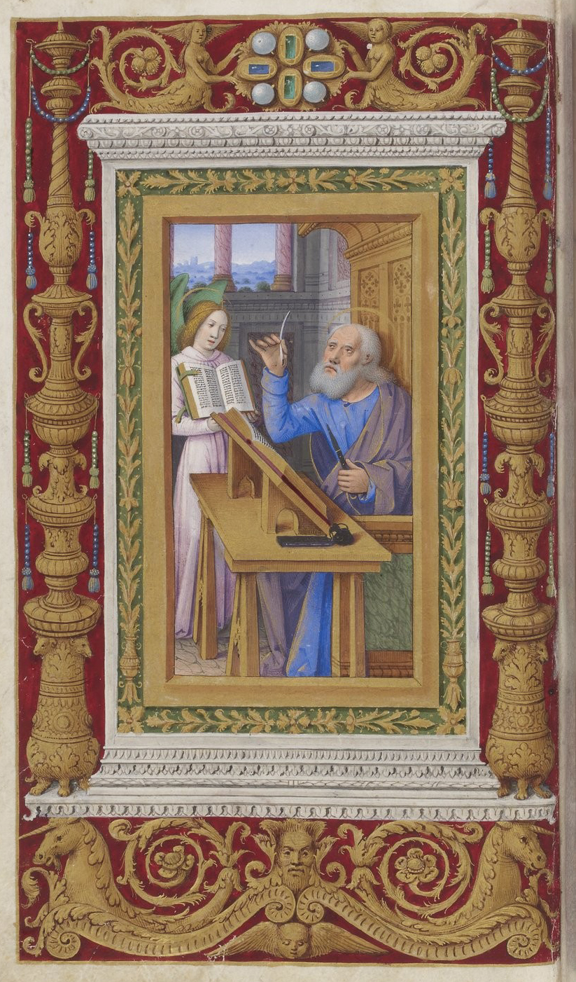
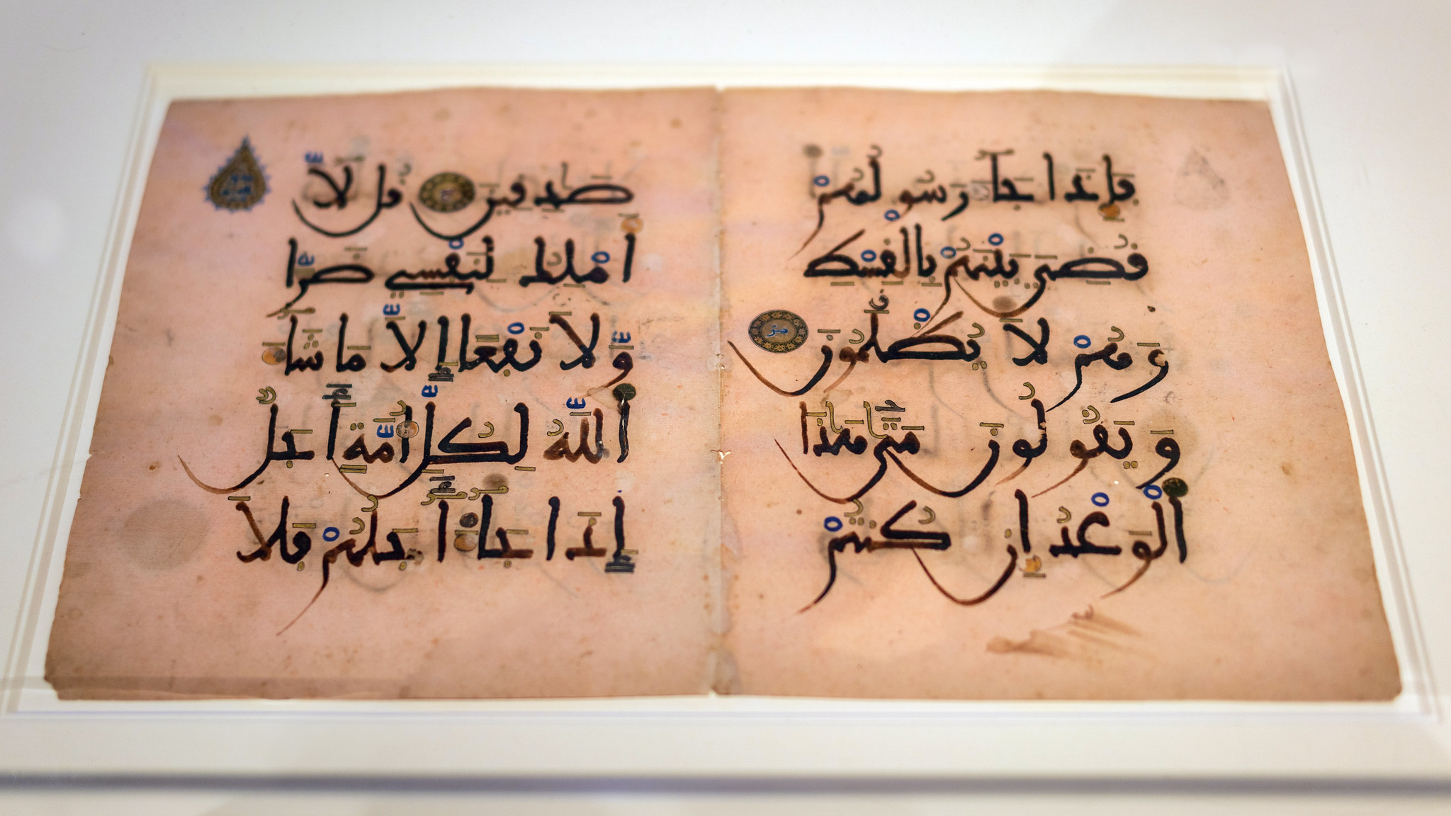
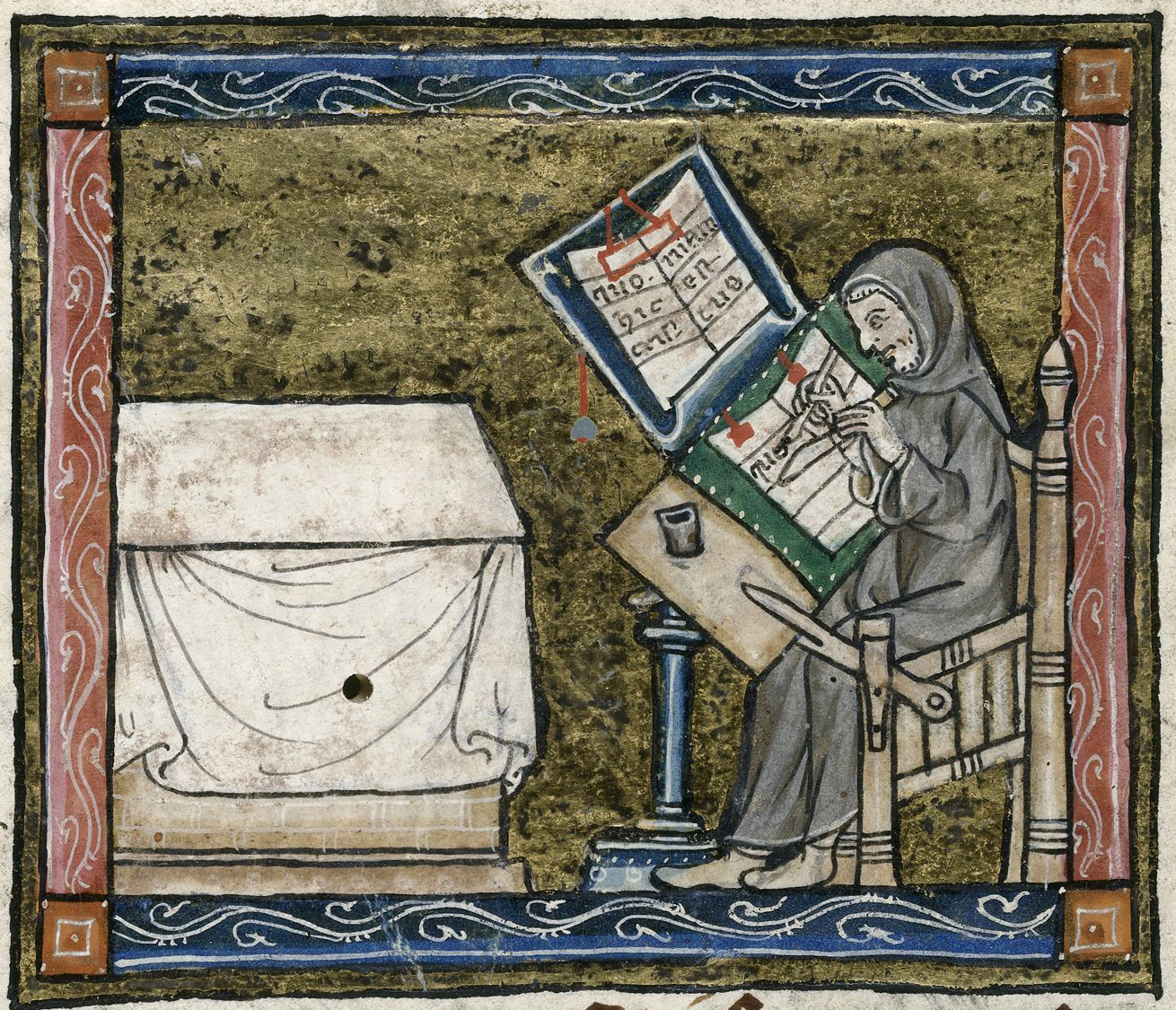
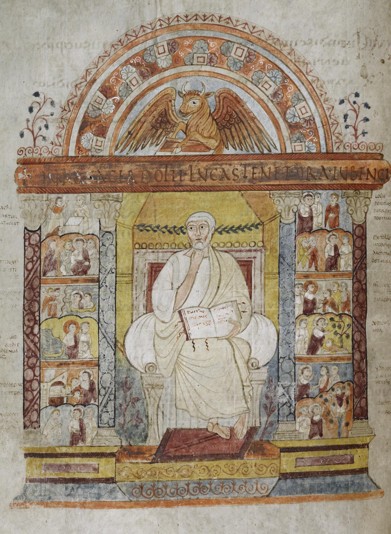
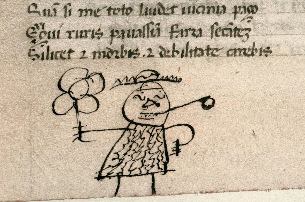


![Jonicus, the First Astronomer in World Chronicle, about 1400–1410, Rudolf von Ems, made in Regensburg, Germany (The J. Paul Getty Museum, Ms. 33 [88.MP.70], fol. 12)](https://smarthistory.org/wp-content/uploads/2022/01/1_Jonicus.jpeg)
![Philosophy Presenting the Seven Liberal Arts to Boethius from Consolation of Philosophy, about 1460–70, Boethius, made in Paris, France (The J. Paul Getty Museum, Ms. 42 [81.MS.11], leaf 2, verso)](https://smarthistory.org/wp-content/uploads/2022/01/2_Philosophy.jpeg)
![The Planet Jupiter Represented as a Bishop on Horseback (left) and Venus Riding a Stag (right) in an Astronomical Miscellany, shortly after 1464, made in Ulm or Augsburg, Germany (The J. Paul Getty Museum, Ms. Ludwig XII 8 [83.MO.137], fols. 49v and 50v)](https://smarthistory.org/wp-content/uploads/2022/01/3_Jupiter.jpeg)
![Pisces and Diagram for Friday (left) and Libra and Taurus (right) in an Astronomical Miscellany, shortly after 1464, Ulm or Augsburg, Germany (The J. Paul Getty Museum, Ms. Ludwig XII 8 [83.MO.137], fols. 56v-57)](https://smarthistory.org/wp-content/uploads/2022/01/4_Pisces.jpeg)
![April Calendar Page with Saint George (left) and May Calendar Page with Gemini and Courtly Love (right) in a Book of Hours, about 1440–50, made in Paris, France (The J. Paul Getty Museum, Ms. Ludwig IX 6 [83.ML.102], fols. 4v-5)](https://smarthistory.org/wp-content/uploads/2022/01/5_AprilMay.jpeg)
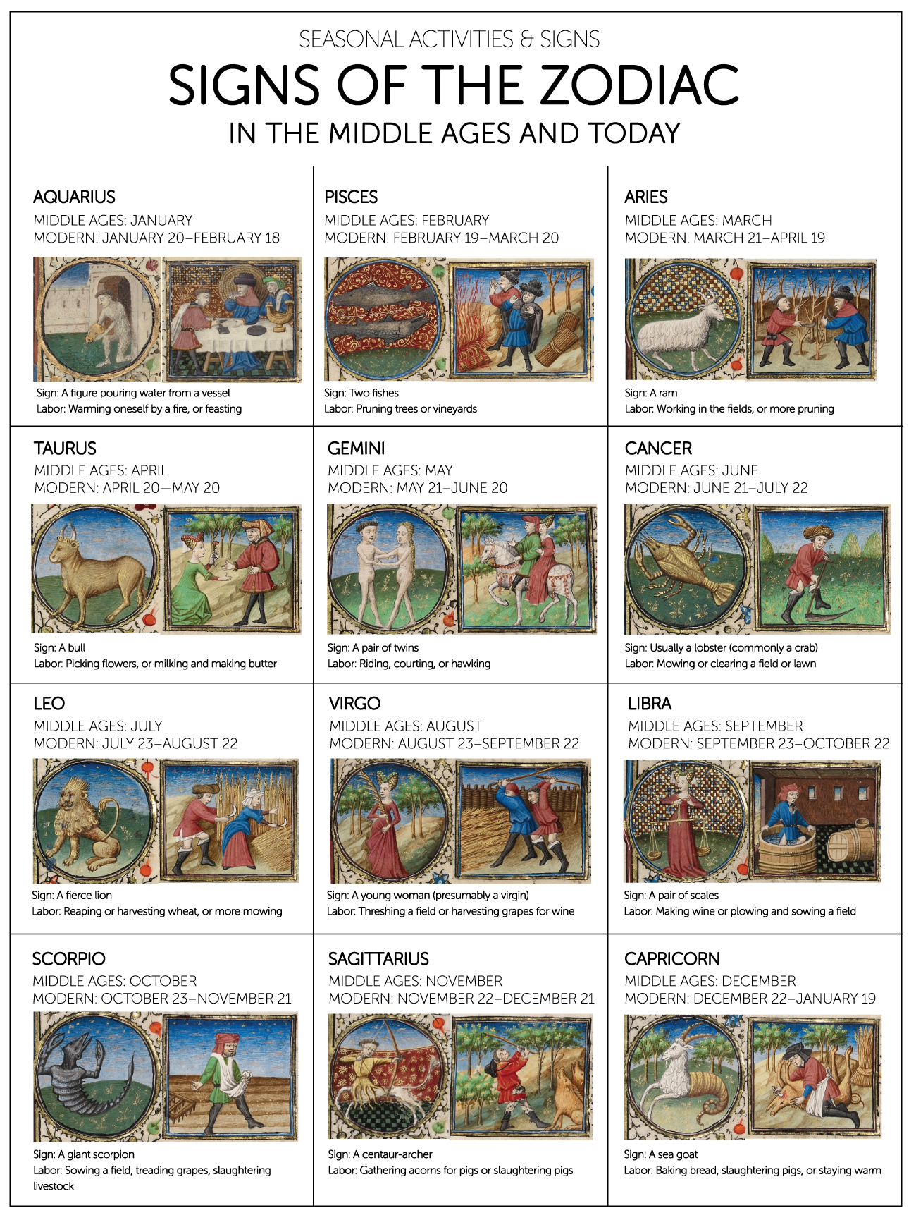
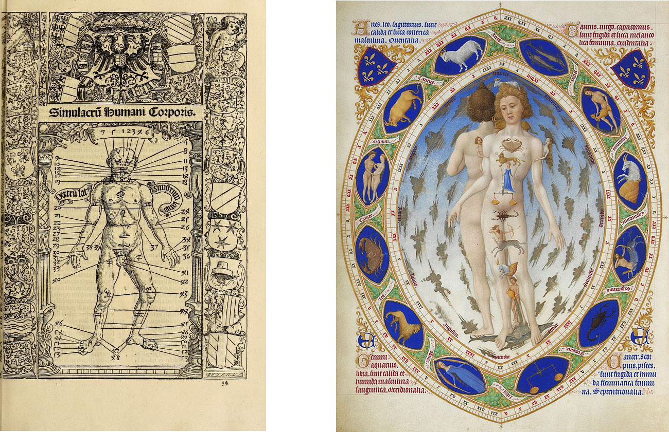
![Left: The Fall of the Rebel Angels in Livre de Bonnes Meurs, about 1430, made in Avignon, France (The J. Paul Getty Museum, Ms. Ludwig XIV 9 [83.MQ.170], fol. 3v); right: The Crucifixion in the Katherine Hours, about 1480–85, Jean Bourdichon, made in Tours, France (The J. Paul Getty Museum, Ms. 6 [84.ML.746], fol. 77)](https://smarthistory.org/wp-content/uploads/2022/01/8_RebelAngels.jpeg)
![The Woman Clothed in the Sun in the Getty Apocalypse, about 1255–60, probably made in London, England (The J. Paul Getty Museum, Ms. Ludwig III 1 [83.MC.72], fols. 19v-20)](https://smarthistory.org/wp-content/uploads/2022/01/9_Woman.jpeg)
![Left: Initial C: The Creation of the World from a noted breviary, about 1420, made in northeastern Italy (The J. Paul Getty Museum, Ms. 24 [86.ML.674], leaf 5); right: Map Rock petroglyph, 1054, Shoshone-Bannock People, Givens Hot Springs, Canyon County, southwestern Idaho (photo: Kenneth D. and Rosemarie Ann Keene)](https://smarthistory.org/wp-content/uploads/2022/01/10_Map.jpeg)
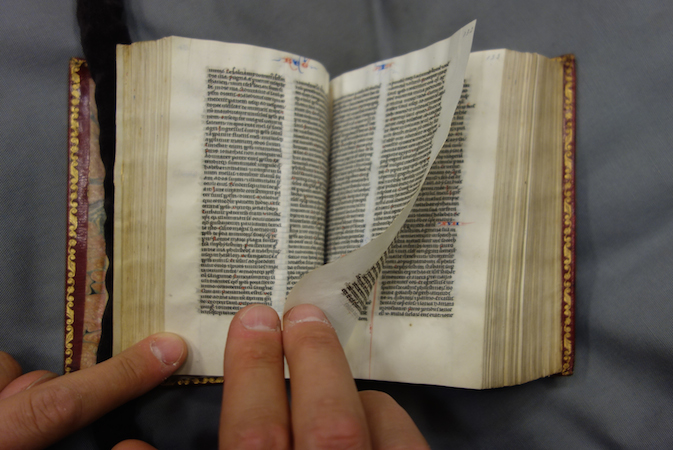
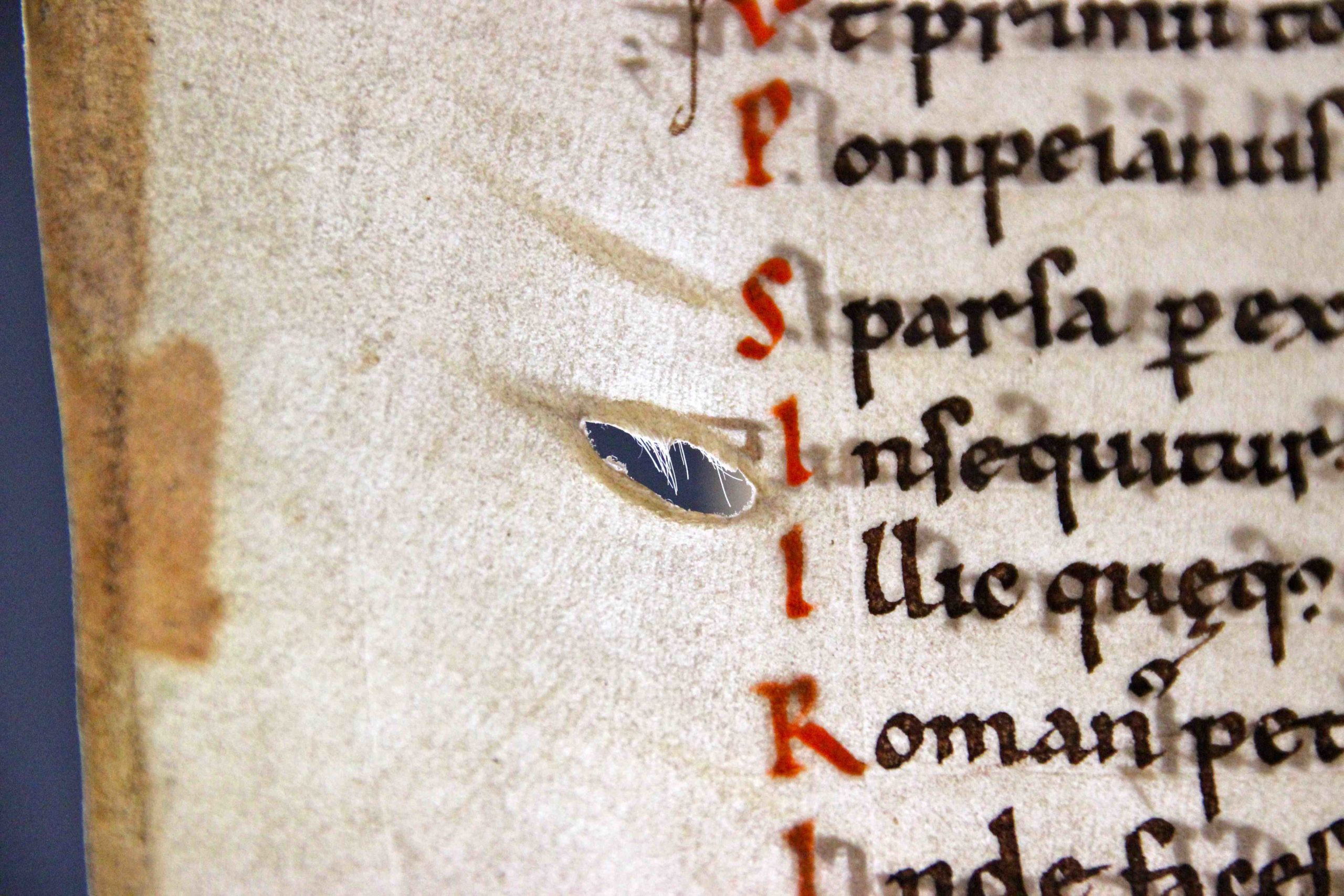
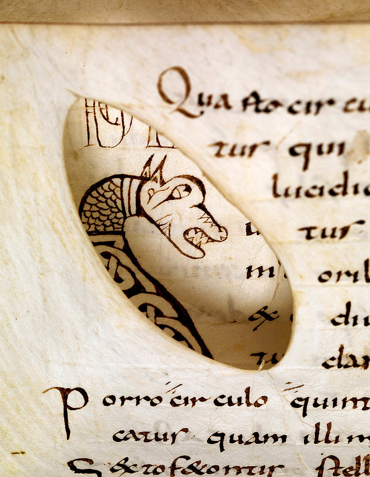
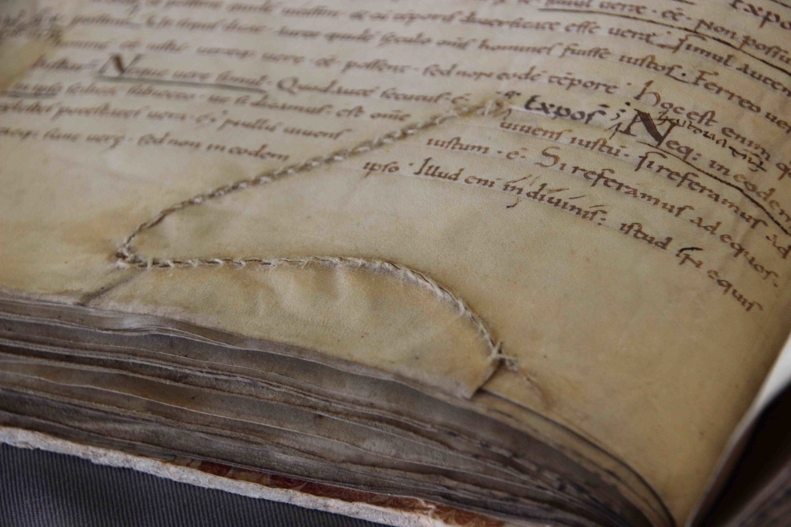
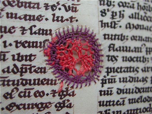
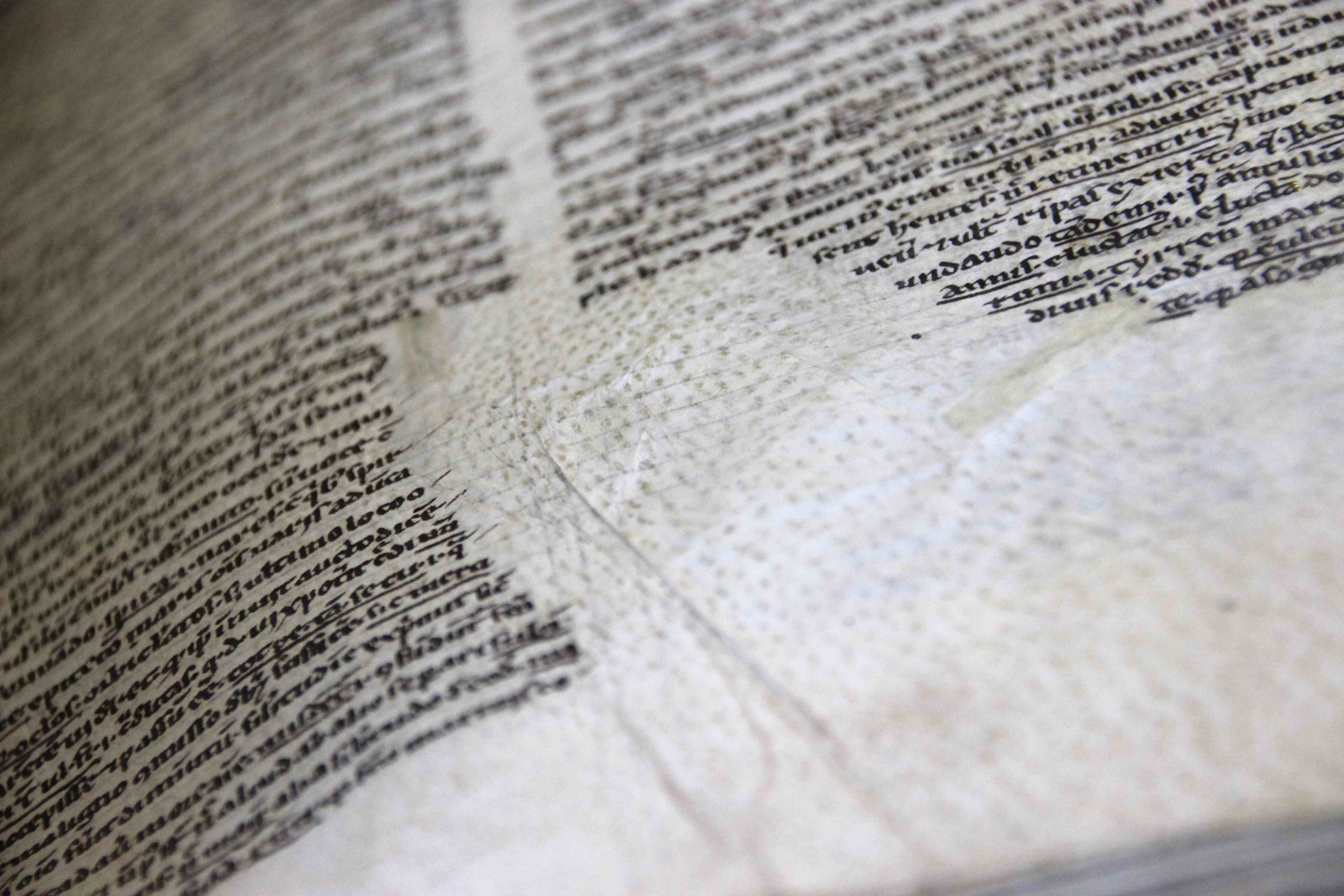


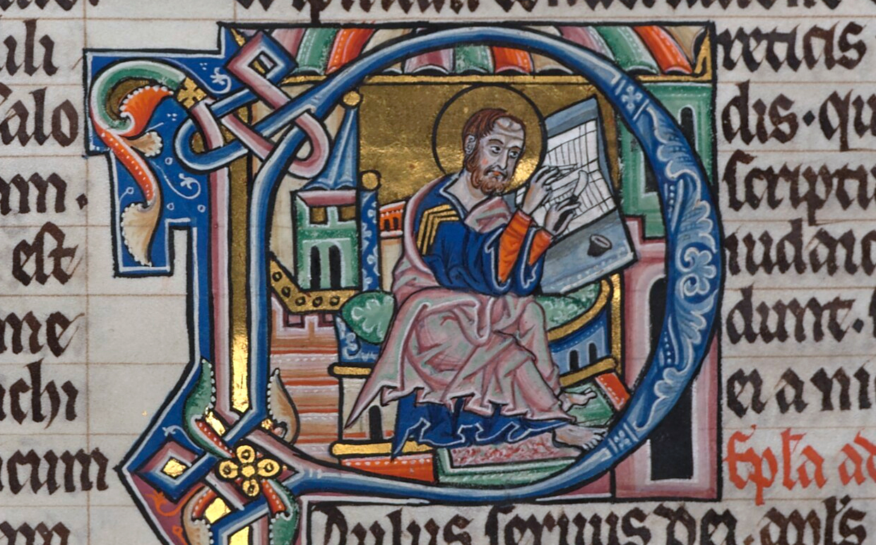
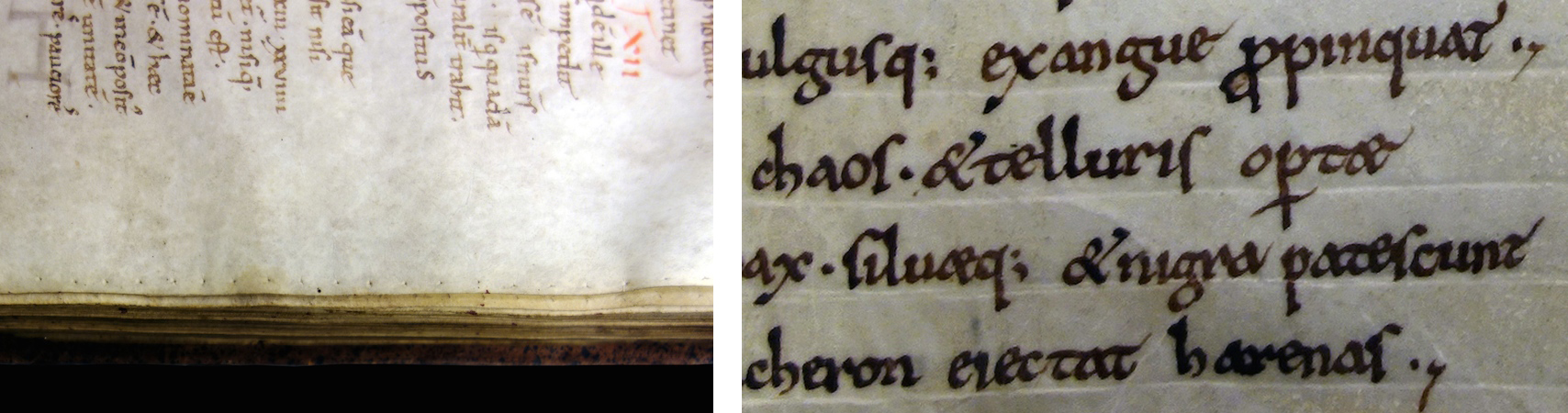
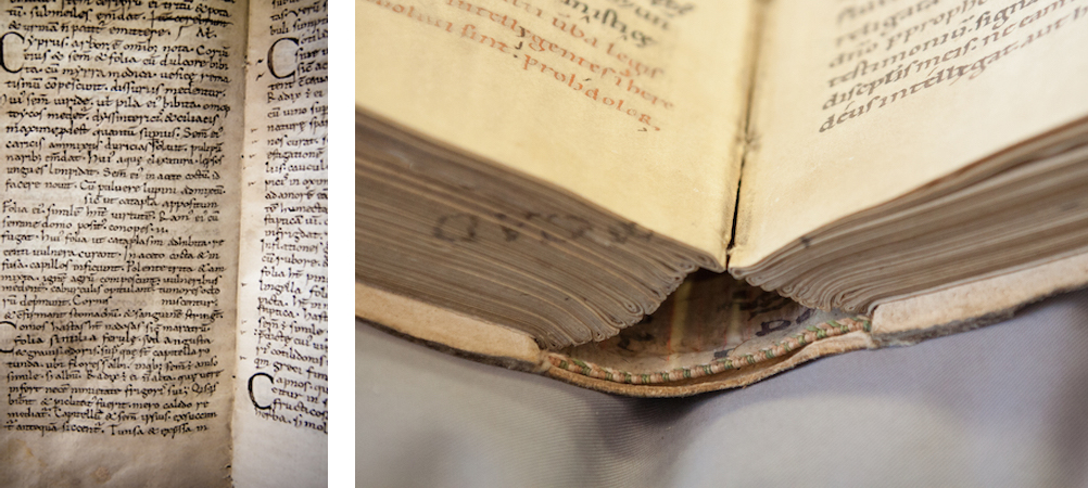


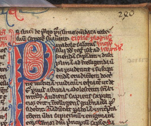


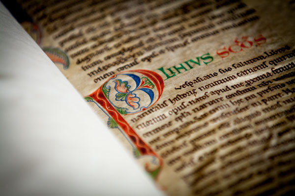


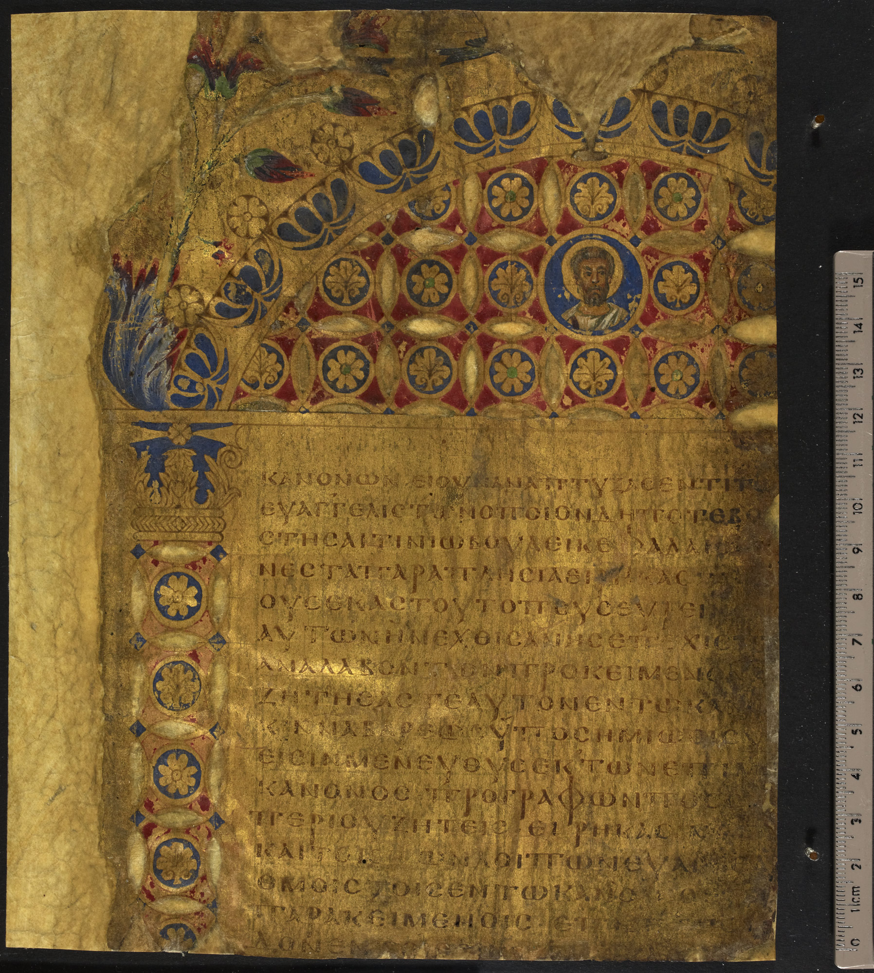

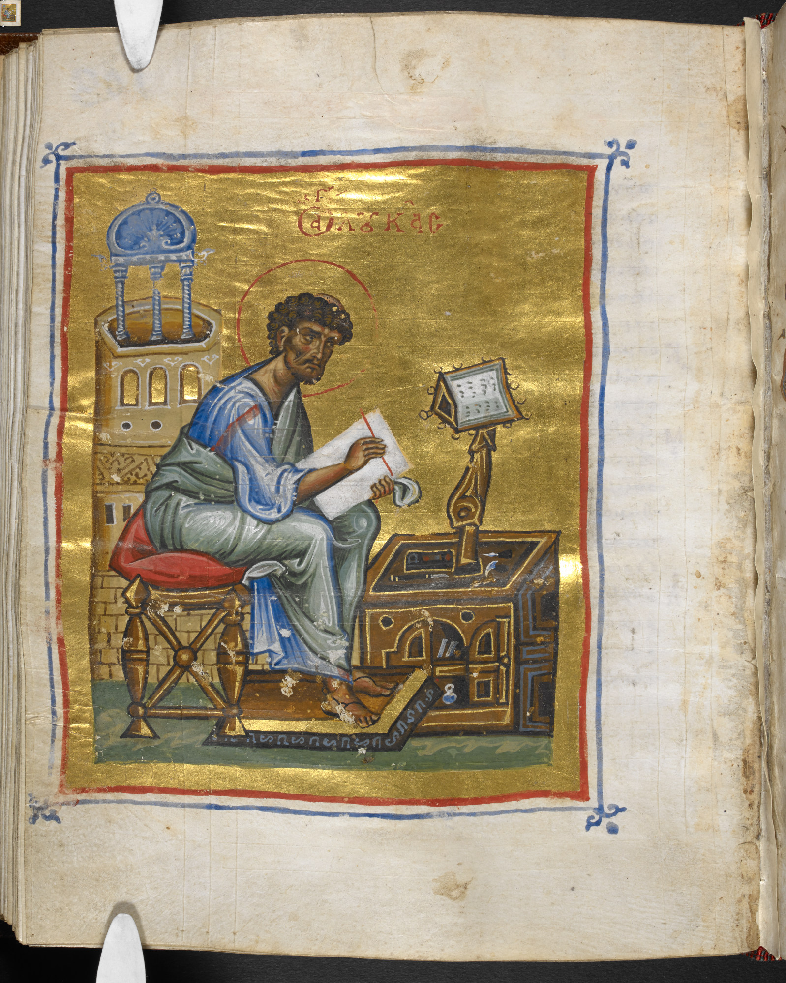
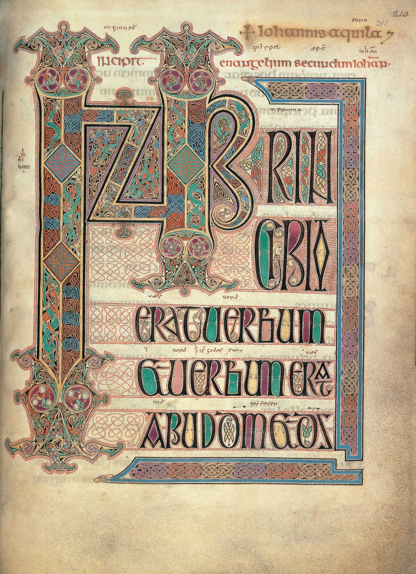
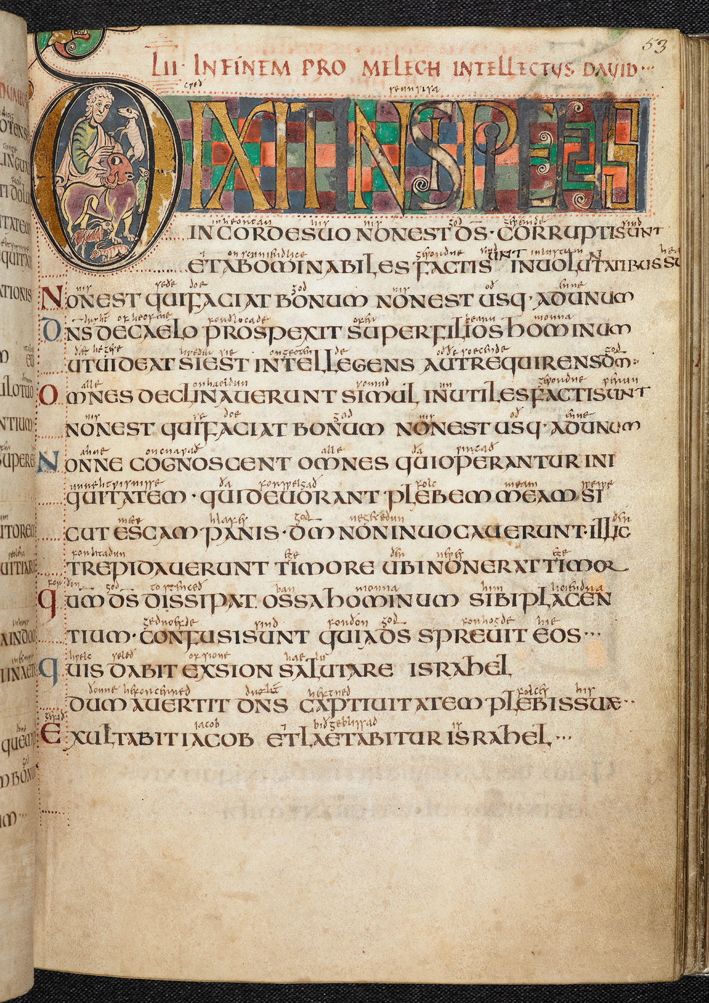

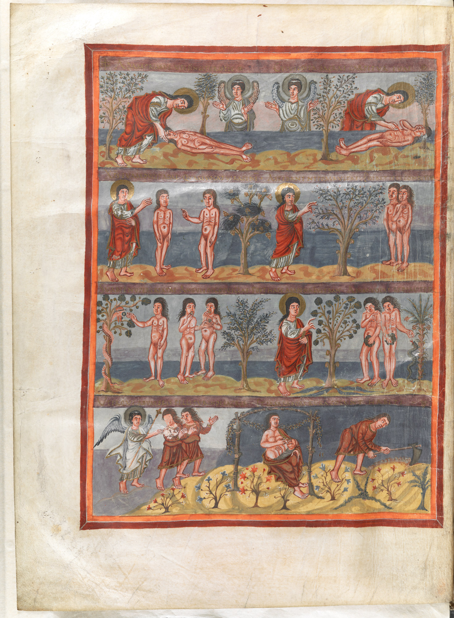
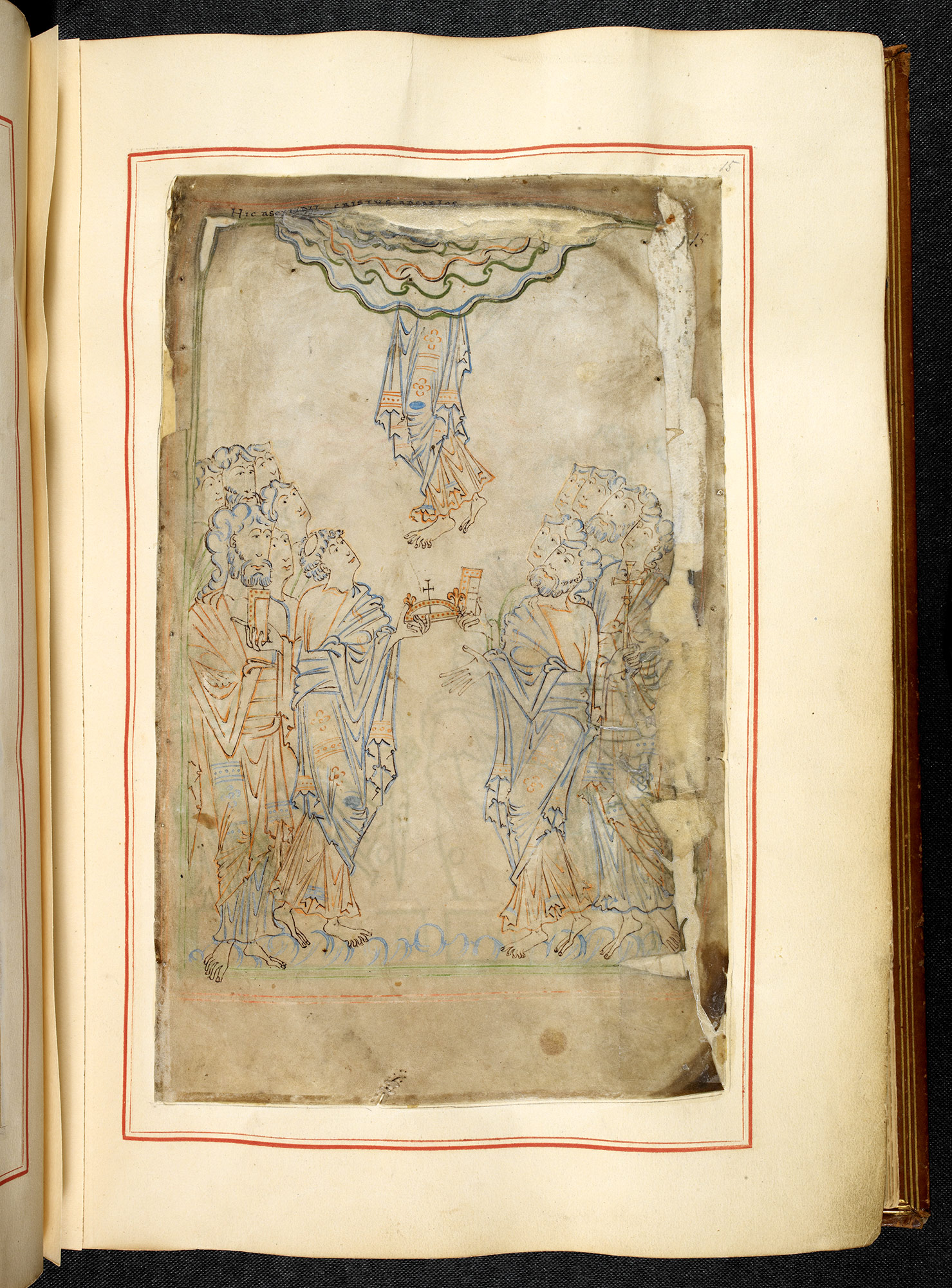
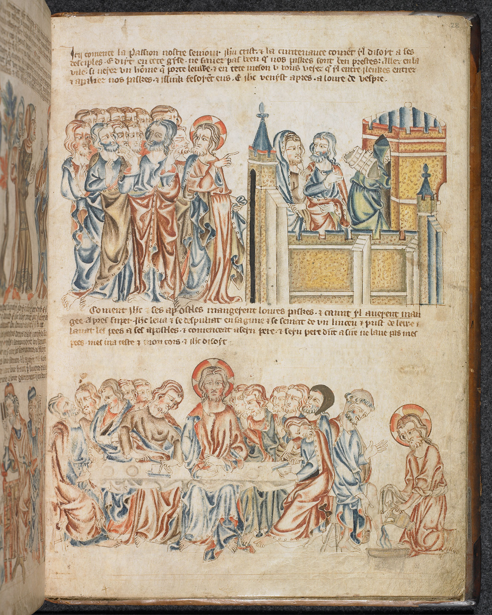
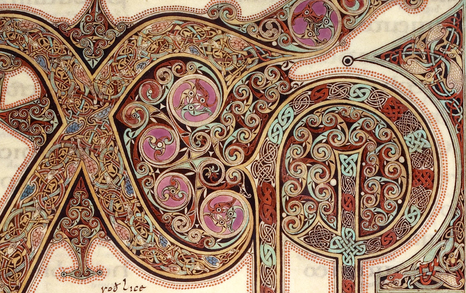
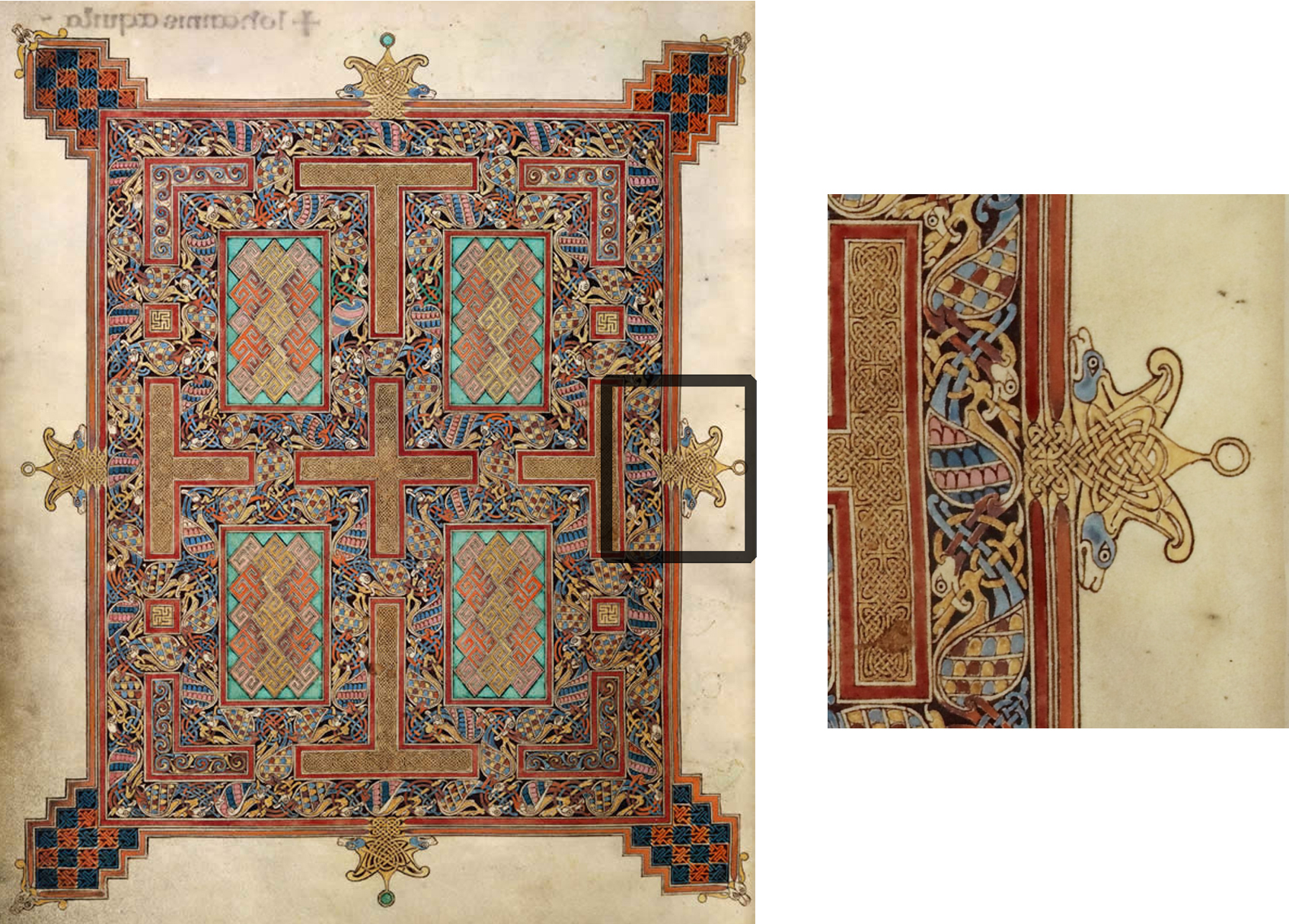
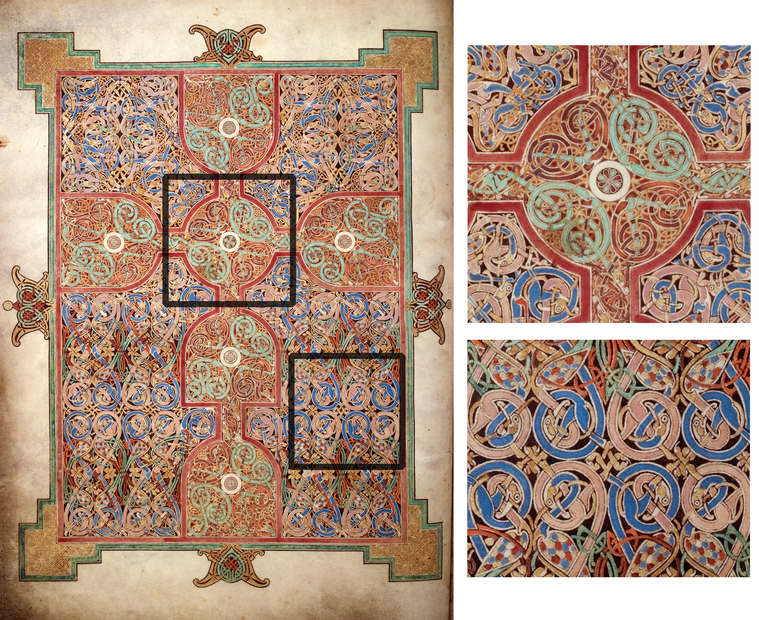
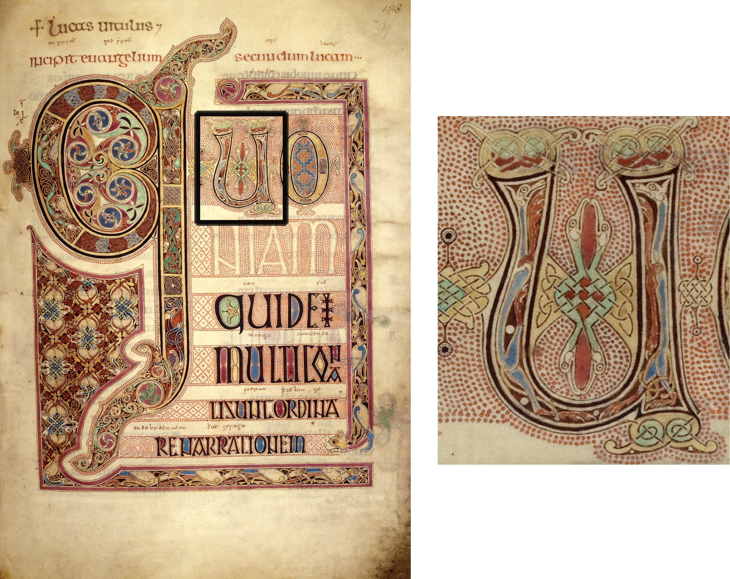
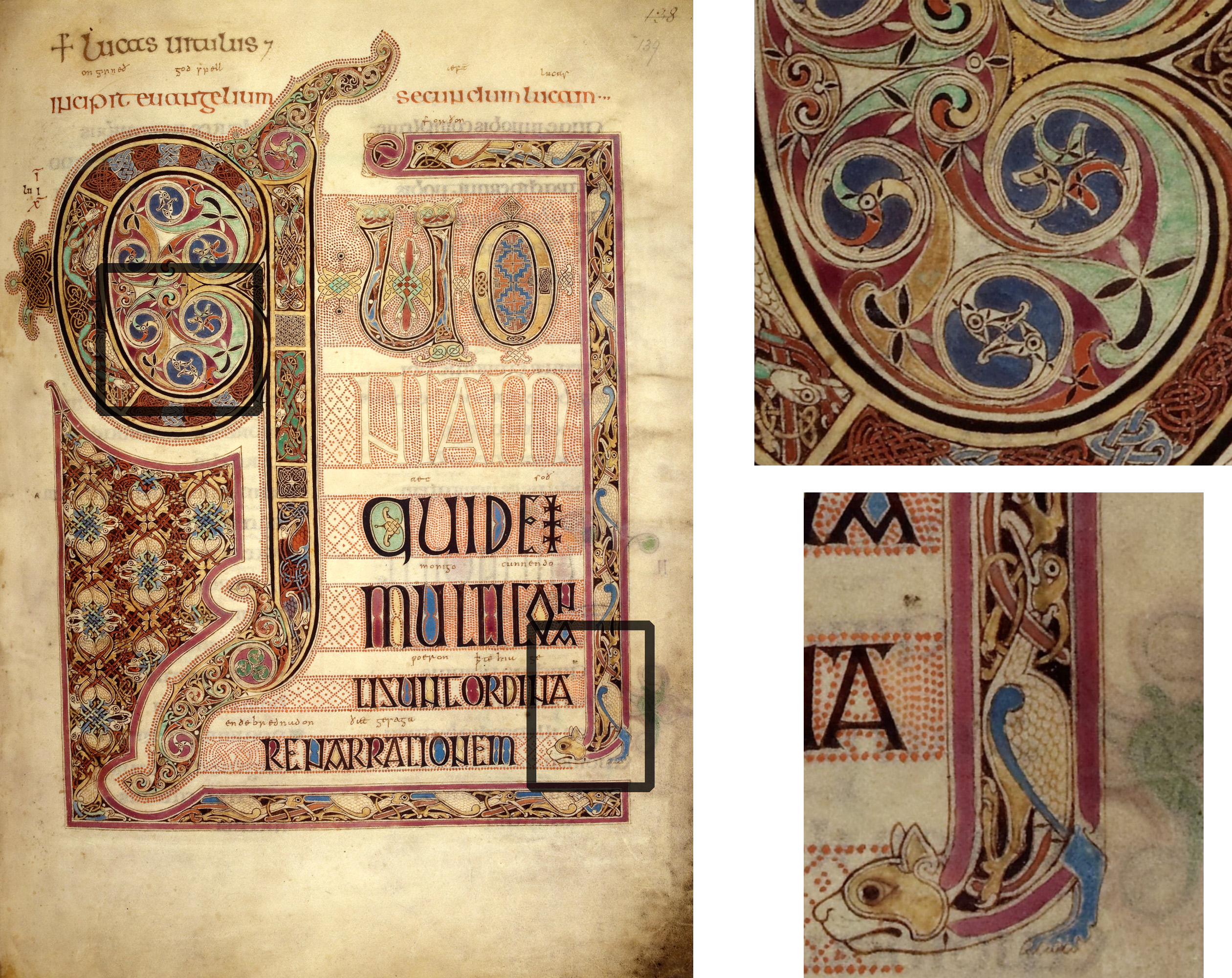
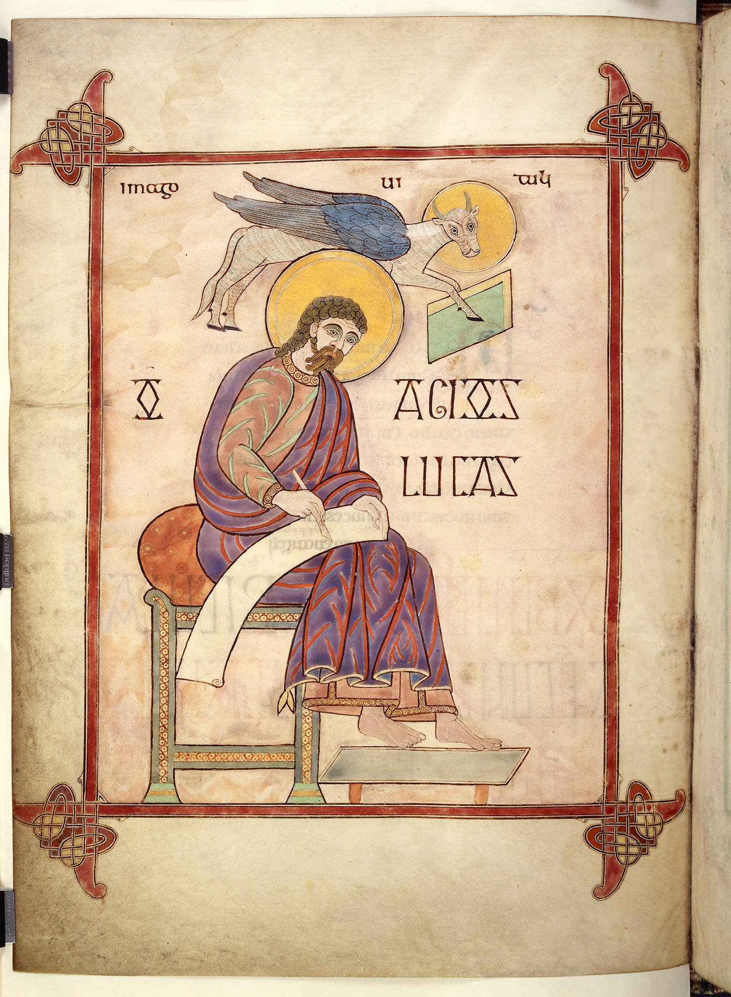
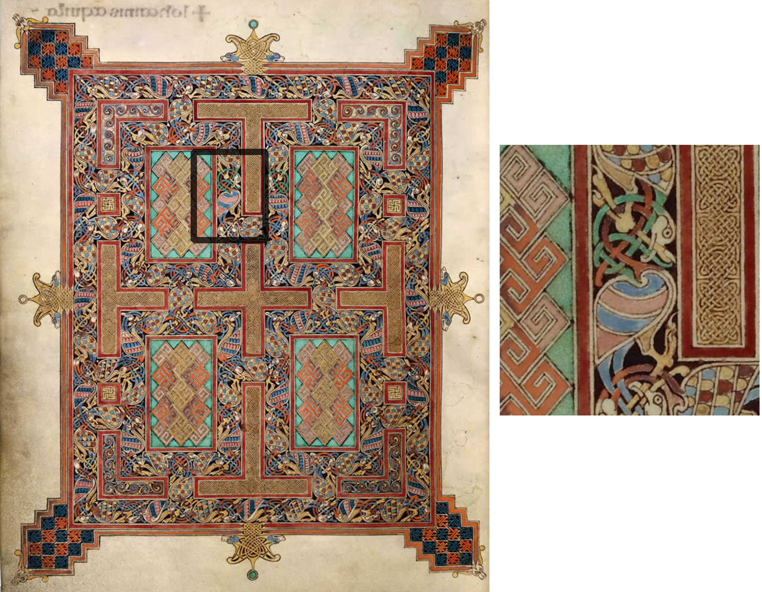
