Accessibility: Getting Started
Ensuring accessibility can be a daunting task. But don’t get overwhelmed! Before we dive into practical guidance, here’s a few pieces of advice as you’re starting your accessibility journey:
- Start now! It’s much easier to incorporate accessible practices at the beginning than add them in later. For example, use heading styles to structure your document so later you won’t need to figure out what was supposed to be an H2 and what was supposed to be an H3.
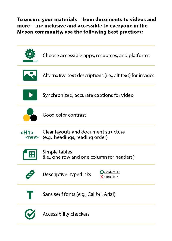
- Just pick one thing to start with! This advice comes from our friends at GMU’s Assistive Technology Initiative, who provide wonderful accessibility support to the GMU community, including VIVA. They even have a handy list of top practices to help ensure accessibility:
- Choose accessible apps, resources, and platforms
- Alternative text descriptions (i.e., alt text) for images
- Synchronized, accurate captions for video
- Good color contrast
- Clear Layouts and document structure (e.g. headings)
- Simple tables (i.e., one row and one column for headers)
- Descriptive Hyperlinks
- Sans serif fonts (e.g., Calibri, Arial)
- Accessibility Checkers
- Once you start using the accessibility practices, integrate them beyond your OER/publishing work. At some point, using heading styles and checking color contrast will become second nature. This will ensure that all of your practices are accessible, no matter the venue.
Use this chapter to learn how to use these top accessibility best practices.
Unsure where to start? We recommend Document Structure and Alt Text.
Accessible Apps and Platforms
Different platforms and applications have different innate accessibility levels.
EPUBs
EPUBs, with their ability to reflow text and change font, background, and more, make them the best ebook option for accessibility. For that reason, VIVA aims to create EPUBs for all of our supported publications.
EPUBs are not inherently accessible, and they do rely on certain formatting to make them accessible. W3C publishes guidelines for Conformance and Discoverability Requirements for EPUB publications. The DAISY consortium also has a DAISY Accessible Publishing Knowledgebase on creating accessible EPUBs.
Pressbooks
Pressbooks as a platform strives to be accessible. The company maintains an Accessibility page on the Pressbooks website, which includes VPATs (Voluntary Product Accessibility Templates) for the platform front- and backend.
Even with basic accessibility built into the platform, the accessibility of your resources will also depend on you following accessibility best practices, such as those outlined in this chapter. The Pressbooks User Guide also includes a chapter titled “Make your Book Accessible and Inclusive” which provides additional guidance for authors.
Accessible Documents
If you prefer you create a document, whether in Word, Google Sheets, Powerpoint, PDF or more, you can have varying levels of accessibility. These platforms are proprietary and so limit downstream use and viewing (except for PDF) to those using the same software. That being said, these platforms are fairly commonplace and we can comfortably assume downstream usage–and editing–for many users.
If using these platforms, make sure to follow accessibility best practices, such as those outlined in this chapter.
Please note that PDF accessibility can be a bit tricky! But if you start from an accessible document and convert to a PDF, most of these features will carry over to the PDF. *Do not print to PDF.*
Document Structure
Headings help to identify the hierarchical structure of a document (e.g., sections, sub-sections). Headings provide a visual cue that helps sighted readers quickly navigate through sections of a document, skimming through content until they find a section they are looking for. Similarly, headings create logical divisions in the content and allow a non-sighted user to navigate a page or document easily using a screen reader. And this structure can go beyond accessibility to helping with learning. When you use chapters, headings, subheadings, and consistent pedagogical elements to organize content, it signals the hierarchy of information. This allows students to see how the main concepts are related clearly. In addition, headings are one of the main ways students using a screen reader navigate through a chapter. [Adapted from OSU OER Faculty Guide 2nd ed by Stefanie Buck and Mark Lane licensed under a Creative Commons Attribution-ShareAlike 4.0 International License.]
When using headings or other structural elements (e.g., lists), you should always use system styles and tools. See design and image accessibility functions for screen readers in Microsoft Word: Screen Reader User’s Experience and MS Word.
General Guidance:
- Use system styles and tools to create structure and organization throughout the document. Do not manually create these. Such structure and organization includes:
- Consistent heading styles
- Lists
- Tables
- Test pages for compatibility with accessibility tools and resolve issues proactively.
Other notes:
- Using headings in Word or Google docs also allows you to create a table of contents and use the navigation panes!
- The microsoft accessibility checker requires that there should be no less than 1 heading per 2 pages
- Use system bullet options
- Avoid customizing bullet characters, as custom characters can result in screen readers reading bullets as ASCII values or as images without alt text.
Resources:
- WebAIM: Text/Typographical Layout
- WebAIM: Headings
- WebAIM: Semantic Structure: Regions, Headings, and Lists
- Microsoft Guidance for Creating Headings
- Microsoft Guidance for Lists
Fonts
Font selection can impact the readability of text, especially those with visual impairments or disabilities like dyslexia. It is important to use clear and consistent fonts to help with ease of readability for all users.
General Guidance:
- It is best to use system fonts and these can be adjusted to meet requirements.
- In web, use CSS to set heading or other styles
- In Microsoft/Google, can select a text and update the style to match your preferences
- Avoids fonts which have complex characters or have characters which may be confused
- Use a limited number of typefaces, fonts, and font variations
- Each new typeface introduces cognitive overhead for the reader.
- Avoid fonts smaller than 10pt
VIVA suggests using:
- Helvetica
- Arial
- Verdana
Other notes:
- The preference for sans serif is no longer universal, in thanks to higher resolution displays.
- There is also no one font that works for those with dyslexia
- Consistency and limited fonts are key to ensure manageable cognitive load
- Look at the Color Contrast section when choosing font colors.
- Consider spacing and weight (or boldness) of fonts. Fonts must be able to withstand enlarging and shrinking of fonts without loosing spacing between letters, words, and lines
- Default system kerning/spacing should be fine.
- Avoid uneven line weight or those with small spaces between characters.
- Google Font Weight definition
- Screen readers do not distinguish between bold, italic, or underline formatting or highlighting. Avoid using these to convey meaning.
- Screen readers do not normally read strikethrough formatting. A screen reader user must then enable a screen reader setting to identify strikethrough content, so you must notify readers within text if this is used.
- Do not use drop caps. These are read as a separate word by screen readers
- Do not use WordArt or other similar options. These are read as images by a screen reader rather than text. If using WordArt, include alt-text for the image.

Resources:
- WebAIM: Typefaces and Fonts
- WebAIM: Text/Typographical Layout
- Design slides for people with Dyslexia (Microsoft)
Color Contrast
When selecting colors for use in resources, it is important to have a high enough color contrast between the background (document/image/highlighting/etc) and foreground (text). This helps both with those who have visual impairments and those who are color blind.
General guidance:
- Color contrast should be a ratio of 4.5:1 or greater
- This includes font and background or highlighting and images
- If font is 14pt and bolded or 18pt, can use a minimum ratio of 3:1
- Do not solely rely on color to convey information
- Includes both for fonts and for graphs and figures
To determine contrast, use a Color Contrast Checker to select both the background and foreground colors. If the ratio does not meet WCAG requirements, you can typically use the color contrast checker to find a similar color which will meet both aesthetics and color contrast requirements.
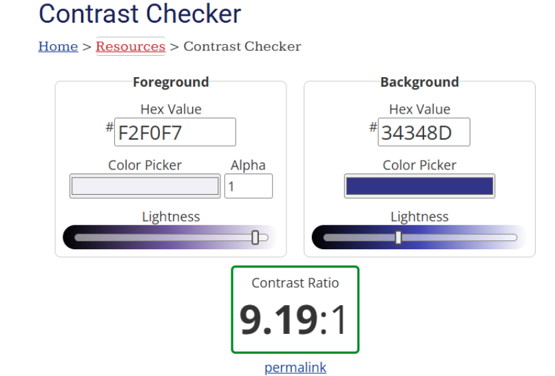
The color contrast tool will also give you pass/fail report for associated WCAG requirements.
When creating charts or graphs, make sure that you do not only use color to convey information (this is also true in general). If someone is color blind, they may not be able to differentiate between the various items. Instead, use other clues, such as:
- Clear labels connected to a part of the graph
- Different patterns or shapes instead of or complement to colors
- Data point callouts next to the area
- Provide a supplementary format, such as a link to a spreadsheet containing the data
Other notes:
- White backgrounds can cause glares for certain readers, especially those with dyslexia. Consider using an off-white instead.
- Especially important for presentation slides.
Resources:
- WebAIM: Contrast and Color Accessibility
- WebAIM: Accessible Images – Color Reliance
- National Eye Institute: Color Blindness
- Data Visualizations, Charts, and Graphs (Harvard)
- BC Campus: Accessibility Toolkit – Color Contrast
Hyperlinks
Creating links that are easily read by a screen reader is important for ensuring accessibility of a resource:
- Screen readers will read out the full URL if it is spelled out. This not only causes cognitive overload for users, but this obscures the item that is being linked to.
- Users can use screen readers to navigate by links. If you use generic text (e.g. “click here,” the user will not know what the link is referring to).
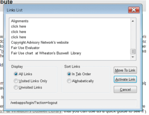
Sample Links List. Notice it is hard to tell the links apart.
As such, you should use descriptive text, which is clear without context, for all VIVA resources.
General Guidance:
- Use underlined text with a color that differentiates it from the surrounding text
- Use descriptive link text that does not rely on context from the surrounding text.
- Avoid generic text (E.g. avoid “here” or “click here”)
- Avoid spelling out the full URL
- Keep the amount of text in the link to a minimum.
- Use underlined text with a color that stands out from the surrounding text.
- The combination of underlined and color helps to indicate links to both those who can see color and those who can’t
Examples (viva BC Campus: Accessibility Toolkit – Links)
- Click here for information on BCcampus Open Education.
- Purpose is not clear
- You can find more information on BCcampus Open Education at http://open.bccampus.ca/.
- Full URL, Purpose of Link is not clear
- Information on BCcampus Open Education is available online.
- Accessible version. It is clear what the link is pointing to and has context outside of the surrounding text.
Other notes:
- It is recommended to use hyperlinks in online resources, but include an appendix with URLs when a print version will be made available.
- If inclusion of a URL is required (e.g. citation, list of links for print reader), make it clear to the reader that the full URL will be included.
- Alternately, use aria labels to indicate what the screen reader should read aloud
- If the link will open a new file format, include that alongside the link
- E.g. VIVA Style Guide [PDF]
- Opening content in a new tab or window can be disorienting for people who have visual impairments.
- Avoid doing so or indicate when opening in a new tab/window in the link
- E.g. VIVA Style Guide [New Tab]
- Avoid doing so or indicate when opening in a new tab/window in the link
Resources:
- WebAIM: Links and Hypertext
- WebAIM: WCAG 2.0 and Link Colors (blog)
- Microsoft Guidance on accessible Links
- Includes example of reading of a link using full URL
- W3C: G200: Opening new windows and tabs from a link only when necessary
- BC Campus: Accessibility Toolkit – Links
Images and Alternative Text
General Guidance:
- Avoid complex or overly subtle visuals that may hinder comprehension.
- Avoid adding text to images.
- This includes both word art, which is read as an image (see Fonts and Accessibility Guidance) and including text within an image
- Consider if the information can be conveyed in another format (e.g. table).
- If text is included in images, alt text should include the written text.
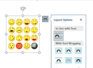
- Images should be text wrapped as inline
- Otherwise, they may not be read by a screen reader.
General Resources
Alt-Text Guidance:
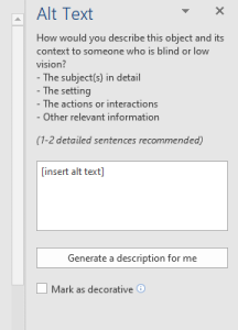
Alternative text (Alt text) is used to convey the content of items which may be missed by someone with visual impairments. Instead of seeing the object, a screen reader will read the alt text. Thus, it is important to convey all needed information in the alt text.
- Include descriptive alt text for meaningful images to improve accessibility and accommodate screen readers.
- For decorative images, mark images as decorative, if able (e.g., check box in Microsoft Word) or leave the alt text blank (i.e.,””)
- The text should clearly and succinctly describe the image’s purpose and content.
- Think about why are you including the image in the document: What information do you want the reader to take away from the image?
- Include any text included in the image in the alt text
- If alt text is too long, include a long description or link to another page with full alt text.
- Code we’re using for OER to include long descriptions in Pressbooks:
<img src=“[Image source” alt=”[alt text].” width=”X” height=”X” aria-details=”[fig ID]” />
<details id=”[fig ID]”><summary>Long Description for Figure X</summary>
<p>[Long description]</p>
This is essential for users relying on screen readers to understand visual information. For example, describe the context or message conveyed by an image instead of using generic descriptions like “image of a person.”
Other notes:
- Alt text should not contain any extra or unnecessary information, and should not repeat information that is already provided in the text or caption.
- Avoid using phrases like, “Image of” to start off your alt text. These are implied and just add cognitive load for the users.
- Alt text should refer to relevant content provided by the image, rather than simply describing how the image looks.
- Images used as functional objects (e.g. buttons, links) should have alt text which represents what they do/where they go rather than what they look like.
- Images that are the only thing in a link must include alt text to ensure the link is clear to the users
Alt Text Resources:
- WebAIM: Alternative Text
- Microsoft Guidance for Alt-text
- Section 508.gov: Authoring Meaningful Alternative Text
- W3C: Functional Images
- WebAIM: Alt text and linked images (blog)
Videos and Captioning
Providing alternative methods of acquiring the content of videos and audio items is important to ensure that all can access the content.
General Guidance:
- Definitions:
- Captioning: written representation of audio in a video, time-coded to the video. These are able to show on the screen while the video is playing.
- Transcription: written representation of audio in a video presented as one text block. Can be available alongside the video or as a downloadable version.
- All uploaded videos should include captioning.
- Transcriptions are optional for videos, but should be able to be easily generated from captions.
- Audio-only multimedia should include transcriptions
- When the visuals in a video are important (e.g. walking through a visual process or a feature film), an audio description should be included. This describes what is happening on screen for viewers with sight disabilities.
- What is Audio Description?[Video]
Other notes:
- There are statewide contracts for captioning if additional captioning is needed.
- Some video hosting services, like YouTube, will automatically generate captions. We recommend checking these captions for accuracy before sharing with the public.
Resources:
Tables
Creating clear, simple tables with headings ensures that tables can be clearly read by screen readers. For example,
| Dept. Code | Course # | Section | Max. Enrollment | Current Enrollment | Room Number | Days |
| BIO | 100 | 1 | 15 | 13 | 5 | Mon, Wed, Fri |
| ENGL | 200 | 2 | 15 | 7 | 8 | Tues, Thurs |
| PSYCH | 100 | 1 | 15 | 15 | 13 | Wed |
Without markup, screen readers will read each of the cells independently, row by row. If a user navigates to a specific cell, they will only “read” that cell:

With heading styles, the screen reader will read the column and row headers as well as the information in the specific cell.

Images from presentation by Korey Singleton, GMU ATI.
General Guidance:
- Do not use tables to create layouts. Only use tables to convey data/information.
- WebAIM: Layout Tables vs Data Tables has a good overview of the difference between these two
- Use simple tables, when able.
- Simple tables have one row for column headers and one column for row headers
- Avoid using split cells or merged cells
- Make sure that tables include heading rows and columns, as appropriate.
- Headers should be indicated using system settings/code not by bold/heading styles.
- In html code: <th> (table header) instead of <td> (table data)
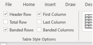
- In Word documents, go to Table Design -> Table Style Options
- Check “Header Row” and “First Column”
Other notes:
- Alt text is not required for tables, but can be helpful when tables are complex to provide some additional context for those using screen readers.
- It is recommended to include captions/titles with tables.
- In html, use the caption option to associate it directly with the table itself.

