
23 14. Univariate analysis
Chapter outline
- Where do I start with quantitative data analysis? (12 minute read time)
- Measures of central tendency (17 minute read time, including 5-minute video)
- Frequencies and variability (13 minute read time)
People often dread quantitative data analysis because – oh no – it’s math. And true, you’re going to have to work with numbers. For years, I thought I was terrible at math, and then I started working with data and statistics, and it turned out I had a real knack for it. (I have a statistician friend who claims statistics is not math, which is a math joke that’s way over my head, but there you go.) This chapter, and the subsequent quantitative analysis chapters, are going to focus on helping you understand descriptive statistics and a few statistical tests, NOT calculate them (with a couple of exceptions). Future research classes will focus on teaching you to calculate these tests for yourself. So take a deep breath and clear your mind of any doubts about your ability to understand and work with numerical data.

In this chapter, we’re going to discuss the first step in analyzing your quantitative data: univariate data analysis. Univariate data analysis is a quantitative method in which a variable is examined individually to determine its distribution, or “the way the scores are distributed across the levels of that variable” (Price et. al, Chapter 12.1, para. 2). When we talk about levels, what we are talking about are the possible values of the variable – like a participant’s age, income or gender. (Note that this is different than our earlier discussion in Chaper 10 of levels of measurement, but the level of measurement of your variables absolutely affects what kinds of analyses you can do with it.) Univariate analysis is non-relational, which just means that we’re not looking into how our variables relate to each other. Instead, we’re looking at variables in isolation to try to understand them better. For this reason, univariate analysis is best for descriptive research questions.
So when do you use univariate data analysis? Always! It should be the first thing you do with your quantitative data, whether you are planning to move on to more sophisticated statistical analyses or are conducting a study to describe a new phenomenon. You need to understand what the values of each variable look like – what if one of your variables has a lot of missing data because participants didn’t answer that question on your survey? What if there isn’t much variation in the gender of your sample? These are things you’ll learn through univariate analysis.
14.1 Where do I start with quantitative data analysis?
Learning Objectives
Learners will be able to…
- Define and construct a data analysis plan
- Define key data management terms – variable name, data dictionary, primary and secondary data, observations/cases
No matter how large or small your data set is, quantitative data can be intimidating. There are a few ways to make things manageable for yourself, including creating a data analysis plan and organizing your data in a useful way. We’ll discuss some of the keys to these tactics below.
The data analysis plan
As part of planning for your research, and to help keep you on track and make things more manageable, you should come up with a data analysis plan. You’ve basically been working on doing this in writing your research proposal so far. A data analysis plan is an ordered outline that includes your research question, a description of the data you are going to use to answer it, and the exact step-by-step analyses, that you plan to run to answer your research question. This last part – which includes choosing your quantitative analyses – is the focus of this and the next two chapters of this book.
A basic data analysis plan might look something like what you see in Table 14.1. Don’t panic if you don’t yet understand some of the statistical terms in the plan; we’re going to delve into them throughout the next few chapters. Note here also that this is what operationalizing your variables and moving through your research with them looks like on a basic level.
| Research question: What is the relationship between a person’s race and their likelihood to graduate from high school? |
| Data: Individual-level U.S. American Community Survey data for 2017 from IPUMS, which includes race/ethnicity and other demographic data (i.e., educational attainment, family income, employment status, citizenship, presence of both parents, etc.). Only including individuals for which race and educational attainment data is available. |
Steps in Data Analysis Plan
|
An important point to remember is that you should never get stuck on using a particular statistical method because you or one of your co-researchers thinks it’s cool or it’s the hot thing in your field right now. You should certainly go into your data analysis plan with ideas, but in the end, you need to let your research question and the actual content of your data guide what statistical tests you use. Be prepared to be flexible if your plan doesn’t pan out because the data is behaving in unexpected ways.
Managing your data
Whether you’ve collected your own data or are using someone else’s data, you need to make sure it is well-organized in a database in a way that’s actually usable. “Database” can be kind of a scary word, but really, I just mean an Excel spreadsheet or a data file in whatever program you’re using to analyze your data (like SPSS, SAS, or r). (I would avoid Excel if you’ve got a very large data set – one with millions of records or hundreds of variables – because it gets very slow and can only handle a certain number of cases and variables, depending on your version. But if your data set is smaller and you plan to keep your analyses simple, you can definitely get away with Excel.) Your database or data set should be organized with variables as your columns and observations/cases as your rows. For example, let’s say we did a survey on ice cream preferences and collected the following information in Table 14.2:
| Name | Age | Gender | Hometown | Fav_Ice_Cream |
| Tom | 54 | 0 | 1 | Rocky Road |
| Jorge | 18 | 2 | 0 | French Vanilla |
| Melissa | 22 | 1 | 0 | Espresso |
| Amy | 27 | 1 | 0 | Black Cherry |
There are a few key data management terms to understand:
- Variable name: Just what it sounds like – the name of your variable. Make sure this is something useful, short and, if you’re using something other than Excel, all one word. Most statistical programs will automatically rename variables for you if they aren’t one word, but the names are usually a little ridiculous and long.
- Observations/cases: The rows in your data set. In social work, these are often your study participants (people), but can be anything from census tracts to black bears to trains. When we talk about sample size, we’re talking about the number of observations/cases. In our mini data set, each person is an observation/case.
- Primary data: Data you have collected yourself.
- Secondary data: Data someone else has collected that you have permission to use in your research. For example, for my student research project in my MSW program, I used data from a local probation program to determine if a shoplifting prevention group was reducing the rate at which people were re-offending. I had data on who participated in the program and then received their criminal history six months after the end of their probation period. This was secondary data I used to determine whether the shoplifting prevention group had any effect on an individual’s likelihood of re-offending.
- Data dictionary (sometimes called a code book): This is the document where you list your variable names, what the variables actually measure or represent, what each of the values of the variable mean if the meaning isn’t obvious (i.e., if there are numbers assigned to gender), the level of measurement and anything special to know about the variables (for instance, the source if you mashed two data sets together). If you’re using secondary data, the data dictionary should be available to you.
When considering what data you might want to collect as part of your project, there are two important considerations that can create dilemmas for researchers. You might only get one chance to interact with your participants, so you must think comprehensively in your planning phase about what information you need and collect as much relevant data as possible. At the same time, though, especially when collecting sensitive information, you need to consider how onerous the data collection is for participants and whether you really need them to share that information. Just because something is interesting to us doesn’t mean it’s related enough to our research question to chase it down. Work with your research team and/or faculty early in your project to talk through these issues before you get to this point. And if you’re using secondary data, make sure you have access to all the information you need in that data before you use it.
Let’s take that mini data set we’ve got up above and I’ll show you what your data dictionary might look like in Table 14.3.
| Variable name | Description | Values/Levels | Level of measurement | Notes |
| Name | Participant’s first name | n/a | n/a | First names only. If names appear more than once, a random number has been attached to the end of the name to distinguish. |
| Age | Participant’s age at time of survey | n/a | Interval/Ratio | Self-reported |
| Gender | Participant’s self-identified gender | 0=cisgender female1=cisgender male2=non-binary3=transgender female4=transgender male5=another gender | Nominal | Self-reported |
| Hometown | Participant’s hometown – this town or another town | 0=This town
1=Another town |
Nominal | Self-reported |
| Fav_Ice_Cream | Participant’s favorite ice cream | n/a | n/a | Self-reported |
Key Takeaways
- Getting organized at the beginning of your project with a data analysis plan will help keep you on track. Data analysis plans should include your research question, a description of your data, and a step-by-step outline of what you’re going to do with it.
- Be flexible with your data analysis plan – sometimes data surprises us and we have to adjust the statistical tests we are using.
- Always make a data dictionary or, if using secondary data, get a copy of the data dictionary so you (or someone else) can understand the basics of your data.
Exercises
- Make a data analysis plan for your project. Remember this should include your research question, a description of the data you will use, and a step-by-step outline of what you’re going to do with your data once you have it, including statistical tests (non-relational and relational) that you plan to use. You can do this exercise whether you’re using quantitative or qualitative data! The same principles apply.
- Make a data dictionary for the data you are proposing to collect as part of your study. You can use the example above as a template.
14.2 Measures of central tendency
Learning Objectives
Learners will be able to…
- Explain measures of central tendency – mean, median and mode – and when to use them to describe your data
- Explain the importance of examining the range of your data
- Apply the appropriate measure of central tendency to a research problem or question
A measure of central tendency is one number that can give you an idea about the distribution of your data. The video below gives a more detailed introduction to central tendency. Then we’ll talk more specifically about our three measures of central tendency – mean, median and mode.
One quick note: the narrator in the video mentions skewness and kurtosis. Basically, these refer to a particular shape for a distribution when you graph it out.e.That gets into some more advanced multivariate analysis that we aren’t tackling in this book, so just file them away for a more advanced class, if you ever take on.
There are three key measures of central tendency, which we’ll go into now.
Mean
The mean, also called the average, is calculated by adding all your cases and dividing the sum by the number of cases. You’ve undoubtedly calculated a mean at some point in your life. The mean is the most widely used measure of central tendency because it’s easy to understand and calculate. It can only be used with interval/ratio variables, like age, test scores or years of post-high school education. (If you think about it, using it with a nominal or ordinal variable doesn’t make much sense – why do we care about the average of our numerical values we assigned to certain races?)
The biggest drawback of using the mean is that it’s extremely sensitive to outliers, or extreme values in your data. And the smaller your data set is, the more sensitive your mean is to these outliers. One thing to remember about outliers – they are not inherently bad, and can sometimes contain really important information. Don’t automatically discard them because they skew your data.
Let’s take a minute to talk about how to locate outliers in your data. If your data set is very small, you can just take a look at it and see outliers. But in general, you’re probably going to be working with data sets that have at least a couple dozen cases, which makes just looking at your values to find outliers difficult. The best way to quickly look for outliers is probably to make a scatter plot with excel or whatever database management program you’re using.
Let’s take a very small data set as an example. Oh hey, we had one before! I’ve re-created it in Table 14.5. We’re going to add some more cases to it so it’s a little easier to illustrate what we’re doing.
| Name | Age | Gender | Hometown | Fav_Ice_Cream |
| Tom | 54 | 0 | 1 | Rocky Road |
| Jorge | 18 | 2 | 0 | French Vanilla |
| Melissa | 22 | 1 | 0 | Espresso |
| Amy | 27 | 1 | 0 | Black Cherry |
| Akiko | 28 | 3 | 0 | Chocolate |
| Michael | 32 | 0 | 1 | Pistachio |
| Jess | 29 | 1 | 0 | Chocolate |
| Subasri | 34 | 1 | 0 | Vanilla Bean |
| Brian | 21 | 0 | 1 | Moose Tracks |
| Crystal | 18 | 1 | 0 | Strawberry |
Let’s say we’re interested in knowing more about the distribution of participant age. Let’s see a scatterplot of age (Figure 14.1). On our y-axis (the vertical one) is the value of age, and on our x-axis (the horizontal one) is the frequency of each age, or the number of times it appears in our data set.
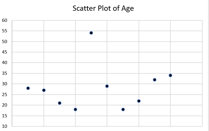
Do you see any outliers in the scatter plot? There is one participant who is significantly older than the rest at age 54. Let’s think about what happens when we calculate our mean with and without that outlier. Complete the two exercises below by using the ages listed in our mini-data set in this section.
Next, let’s try it without the outlier.
With our outlier, the average age of our participants is 28, and without it, the average age is 25. That might not seem enormous, but it illustrates the effects of outliers on the mean.
Just because Tom is an outlier at age 54 doesn’t mean you should exclude him. The most important thing about outliers is to think critically about them and how they could affect your analysis. Finding outliers should prompt a couple of questions. First, could the data have been entered incorrectly? Is Tom actually 24, and someone just hit the “5” instead of the “2” on the number pad? What might be special about Tom that he ended up in our group, given how that he is different? Are there other relevant ways in which Tom differs from our group (is he an outlier in other ways)? Does it really matter than Tom is much older than our other participants? If we don’t think age is a relevant factor in ice cream preferences, then it probably doesn’t. If we do, then we probably should have made an effort to get a wider range of ages in our participants.
Median
The median (also called the 50th percentile) is the middle value when all our values are placed in numerical order. If you have five values and you put them in numerical order, the third value will be the median. When you have an even number of values, you’ll have to take the average of the middle two values to get the median. So, if you have 6 values, the average of values 3 and 4 will be the median. Keep in mind that for large data sets, you’re going to want to use either Excel or a statistical program to calculate the median – otherwise, it’s nearly impossible logistically.
Like the mean, you can only calculate the median with interval/ratio variables, like age, test scores or years of post-high school education. The median is also a lot less sensitive to outliers than the mean. While it can be more time intensive to calculate, the median is preferable in most cases to the mean for this reason. It gives us a more accurate picture of where the middle of our distribution sits in most cases. In my work as a policy analyst and researcher, I rarely, if ever, use the mean as a measure of central tendency. Its main value for me is to compare it to the median for statistical purposes. So get used to the median, unless you’re specifically asked for the mean. (When we talk about t-tests in the next chapter, we’ll talk about when the mean can be useful.)
Let’s go back to our little data set and calculate the median age of our participants (Table 14.6).
| Name | Age | Gender | Hometown | Fav_Ice_Cream |
| Tom | 54 | 0 | 1 | Rocky Road |
| Jorge | 18 | 2 | 0 | French Vanilla |
| Melissa | 22 | 1 | 0 | Espresso |
| Amy | 27 | 1 | 0 | Black Cherry |
| Akiko | 28 | 3 | 0 | Chocolate |
| Michael | 32 | 0 | 1 | Pistachio |
| Jess | 29 | 1 | 0 | Chocolate |
| Subasri | 34 | 1 | 0 | Vanilla Bean |
| Brian | 21 | 0 | 1 | Moose Tracks |
| Crystal | 18 | 1 | 0 | Strawberry |
Remember, to calculate the median, you put all the values in numerical order and take the number in the middle. When there’s an even number of values, take the average of the two middle values.
What happens if we remove Tom, the outlier?
With Tom in our group, the median age is 27.5, and without him, it’s 27. You can see that the median was far less sensitive to him being included in our data than the mean was.
Mode
The mode of a variable is the most commonly occurring value. While you can calculate the mode for interval/ratio variables, it’s mostly useful when examining and describing nominal or ordinal variables. Think of it this way – do we really care that there are two people with an income of $38,000 per year, or do we care that these people fall into a certain category related to that value, like above or below the federal poverty level?
Let’s go back to our ice cream survey (Table 14.7).
| Name | Age | Gender | Hometown | Fav_Ice_Cream |
| Tom | 54 | 0 | 1 | Rocky Road |
| Jorge | 18 | 2 | 0 | French Vanilla |
| Melissa | 22 | 1 | 0 | Espresso |
| Amy | 27 | 1 | 0 | Black Cherry |
| Akiko | 28 | 3 | 0 | Chocolate |
| Michael | 32 | 0 | 1 | Pistachio |
| Jess | 29 | 1 | 0 | Chocolate |
| Subasri | 34 | 1 | 0 | Vanilla Bean |
| Brian | 21 | 0 | 1 | Moose Tracks |
| Crystal | 18 | 1 | 0 | Strawberry |
We can use the mode for a few different variables here: gender, hometown and fav_ice_cream. The cool thing about the mode is that you can use it for numeric/quantitative and text/quantitative variables.
So let’s find some modes. For hometown – or whether the participant’s hometown is the one in which the survey was administered or not – the mode is 0, or “no” because that’s the most common answer. For gender, the mode is 0, or “female.” And for fav_ice_cream, the mode is Chocolate, although there’s a lot of variation there. Sometimes, you may have more than one mode, which is still useful information.
One final thing I want to note about these three measures of central tendency: if you’re using something like a ranking question or a Likert scale, depending on what you’re measuring, you might use a mean or median, even though these look like they will only spit out ordinal variables. For example, say you’re a car designer and want to understand what people are looking for in new cars. You conduct a survey asking participants to rank the characteristics of a new car in order of importance (an ordinal question). The most commonly occurring answer – the mode – really tells you the information you need to design a car that people will want to buy. On the flip side, if you have a scale of 1 through 5 measuring a person’s satisfaction with their most recent oil change, you may want to know the mean score because it will tell you, relative to most or least satisfied, where most people fall in your survey. To know what’s most helpful, think critically about the question you want to answer and about what the actual values of your variable can tell you.
Key Takeaways
- The mean is the average value for a variable, calculated by adding all values and dividing the total by the number of cases. While the mean contains useful information about a variable’s distribution, it’s also susceptible to outliers, especially with small data sets.
- In general, the mean is most useful with interval/ratio variables.
- The median, or 50th percentile, is the exact middle of our distribution when the values of our variable are placed in numerical order. The median is usually a more accurate measurement of the middle of our distribution because outliers have a much smaller effect on it.
- In general, the median is only useful with interval/ratio variables.
- The mode is the most commonly occurring value of our variable. In general, it is only useful with nominal or ordinal variables.
Exercises
- Say you want to know the income of the typical participant in your study. Which measure of central tendency would you use? Why?
- Find an interval/ratio variable and calculate the mean and median. Make a scatter plot and look for outliers.
- Find a nominal variable and calculate the mode.
14.3 Frequencies and variability
Learning Objectives
Learners will be able to…
- Define descriptive statistics and understand when to use these methods.
- Produce and describe visualizations to report quantitative data.
Descriptive statistics refer to a set of techniques for summarizing and displaying data. We’ve already been through the measures of central tendency, (which are considered descriptive statistics) which got their own chapter because they’re such a big topic. Now, we’re going to talk about other descriptive statistics and ways to visually represent data.
Frequency tables
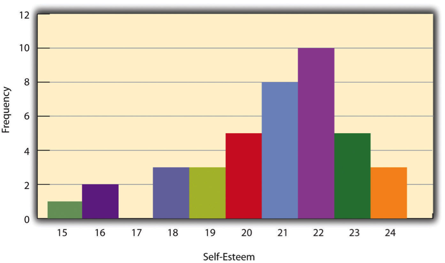
One way to display the distribution of a variable is in a frequency table. Table 14.2, for example, is a frequency table showing a hypothetical distribution of scores on the Rosenberg Self-Esteem Scale for a sample of 40 college students. The first column lists the values of the variable—the possible scores on the Rosenberg scale—and the second column lists the frequency of each score. This table shows that there were three students who had self-esteem scores of 24, five who had self-esteem scores of 23, and so on. From a frequency table like this, one can quickly see several important aspects of a distribution, including the range of scores (from 15 to 24), the most and least common scores (22 and 17, respectively), and any extreme scores that stand out from the rest.
| Self-esteem score (out of 30) | Frequency |
| 24 | 3 |
| 23 | 5 |
| 22 | 10 |
| 21 | 8 |
| 20 | 5 |
| 19 | 3 |
| 18 | 3 |
| 17 | 0 |
| 16 | 2 |
| 15 | 1 |
There are a few other points worth noting about frequency tables. First, the levels listed in the first column usually go from the highest at the top to the lowest at the bottom, and they usually do not extend beyond the highest and lowest scores in the data. For example, although scores on the Rosenberg scale can vary from a high of 30 to a low of 0, Table 14.8 only includes levels from 24 to 15 because that range includes all the scores in this particular data set. Second, when there are many different scores across a wide range of values, it is often better to create a grouped frequency table, in which the first column lists ranges of values and the second column lists the frequency of scores in each range. Table 14.9, for example, is a grouped frequency table showing a hypothetical distribution of simple reaction times for a sample of 20 participants. In a grouped frequency table, the ranges must all be of equal width, and there are usually between five and 15 of them. Finally, frequency tables can also be used for nominal or ordinal variables, in which case the levels are category labels. The order of the category labels is somewhat arbitrary, but they are often listed from the most frequent at the top to the least frequent at the bottom.
| Reaction time (ms) | Frequency |
| 241–260 | 1 |
| 221–240 | 2 |
| 201–220 | 2 |
| 181–200 | 9 |
| 161–180https://fetzer.org/sites/default/files/images/stories/pdf/selfmeasures/Self_Measures_for_Self-Esteem_ROSENBERG_SELF-ESTEEM.pdf | 4 |
| 141–160 | 2 |
Histograms
A histogram is a graphical display of a distribution. It presents the same information as a frequency table but in a way that is grasped more quickly and easily. The histogram in Figure 14.2 presents the distribution of self-esteem scores in Table 14.8. The x-axis (the horizontal one) of the histogram represents the variable and the y-axis (the vertical one) represents frequency. Above each level of the variable on the x-axis is a vertical bar that represents the number of individuals with that score. When the variable is quantitative, as it is in this example, there is usually no gap between the bars. When the variable is nominal or ordinal, however, there is usually a small gap between them. (The gap at 17 in this histogram reflects the fact that there were no scores of 17 in this data set.)
Distribution shapes
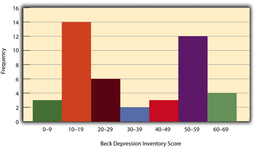
When the distribution of a quantitative variable is displayed in a histogram, it has a shape. The shape of the distribution of self-esteem scores in Figure 14.2 is typical. There is a peak somewhere near the middle of the distribution and “tails” that taper in either direction from the peak. The distribution of Figure 14.2 is unimodal, meaning it has one distinct peak, but distributions can also be bimodal, as in Figure 14.3, meaning they have two distinct peaks. Figure 14.3, for example, shows a hypothetical bimodal distribution of scores on the Beck Depression Inventory. I know we talked about the mode mostly for nominal or ordinal variables, but you can actually use histograms to look at the distribution of interval/ratio variables, too, and still have a unimodal or bimodal distribution even if you aren’t calculating a mode. Distributions can also have more than two distinct peaks, but these are relatively rare in social work research.
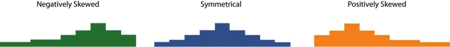
Another characteristic of the shape of a distribution is whether it is symmetrical or skewed. The distribution in the center of Figure 14.4 is symmetrical. Its left and right halves are mirror images of each other. The distribution on the left is negatively skewed, with its peak shifted toward the upper end of its range and a relatively long negative tail. The distribution on the right is positively skewed, with its peak toward the lower end of its range and a relatively long positive tail.
Range: A simple measure of variability
The variability of a distribution is the extent to which the scores vary around their central tendency. Consider the two distributions in Figure 14.5, both of which have the same central tendency. The mean, median, and mode of each distribution are 10. Notice, however, that the two distributions differ in terms of their variability. The top one has relatively low variability, with all the scores relatively close to the center. The bottom one has relatively high variability, with the scores are spread across a much greater range.
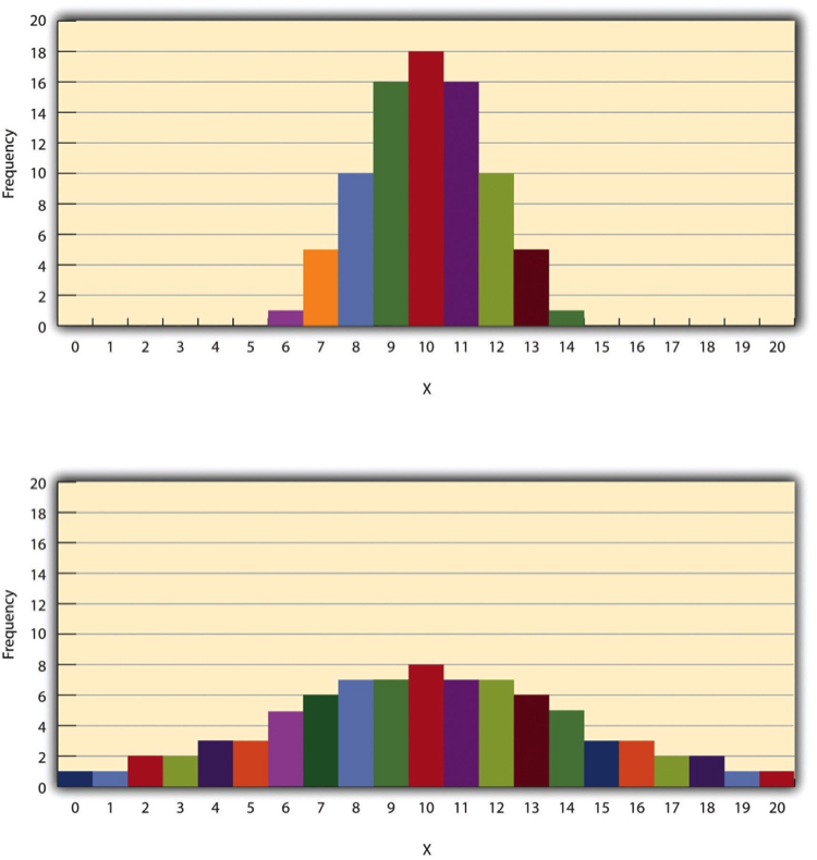
One simple measure of variability is the range, which is simply the difference between the highest and lowest scores in the distribution. The range of the self-esteem scores in Table 12.1, for example, is the difference between the highest score (24) and the lowest score (15). That is, the range is 24 − 15 = 9. Although the range is easy to compute and understand, it can be misleading when there are outliers. Imagine, for example, an exam on which all the students scored between 90 and 100. It has a range of 10. But if there was a single student who scored 20, the range would increase to 80—giving the impression that the scores were quite variable when in fact only one student differed substantially from the rest.
Key Takeaways
- Descriptive statistics are a way to summarize and display data, and are essential to understand and report your data.
- A frequency table is useful for nominal and ordinal variables and is needed to produce a histogram
- A histogram is a graphic representation of your data that shows how many cases fall into each level of your variable.
- Variability is important to understand in analyzing your data because studying a phenomenon that does not vary for your population does not provide a lot of information.
Exercises
- Think about the dependent variable in your project. What would you do if you analyzed its variability for people of different genders, and there was very little variability?
- What do you think it would mean if the distribution of the variable were bimodal?
Univariate data analysis is a quantitative method in which a variable is examined individually to determine its distribution.
the way the scores are distributed across the levels of that variable.
The possible values of the variable - like a participant's age, income or gender.
Referring to data analysis that doesn't examine how variables relate to each other.
An ordered outline that includes your research question, a description of the data you are going to use to answer it, and the exact analyses, step-by-step, that you plan to run to answer your research question.
The process of determining how to measure a construct that cannot be directly observed
A group of statistical techniques that examines the relationship between at least three variables
The name of your variable.
The rows in your data set. In social work, these are often your study participants (people), but can be anything from census tracts to black bears to trains.
Data someone else has collected that you have permission to use in your research.
This is the document where you list your variable names, what the variables actually measure or represent, what each of the values of the variable mean if the meaning isn't obvious.
One number that can give you an idea about the distribution of your data.
Also called the average, the mean is calculated by adding all your cases and dividing the total by the number of cases.
Extreme values in your data.
A graphical representation of data where the y-axis (the vertical one along the side) is your variable's value and the x-axis (the horizontal one along the bottom) represents the individual instance in your data.
The value in the middle when all our values are placed in numerical order. Also called the 50th percentile.
The most commonly occurring value of a variable.
A technique for summarizing and presenting data.
A table that lays out how many cases fall into each level of a varible.
a graphical display of a distribution.
A distribution with one distinct peak when represented on a histogram.
A distribution with two distinct peaks when represented on a histogram.
A distribution with a roughly equal number of cases on either side of the median.
A distribution where cases are clustered on one or the other side of the median.
The extent to which the levels of a variable vary around their central tendency (the mean, median, or mode).
The difference between the highest and lowest scores in the distribution.
